Saturday, May 21, 2011

Outside: Bradford Pear blossoms

I'm going to play catch-up with the spring blossom pics that I took this season, since it's rainy and I seem to be working on a project that does not involve wandering around aimlessly in down town areas photographing other people's trees & flowers. I've gotten some looks and concerned questions from some on-lookers this year — yes, I'm taking pictures of a tree in broad daylight wearing a bright magenta colored shirt — uh-huh, that would kind of make me a terrible burgler, wouldn't it? I mean, where's the stealth?

So, yes, this tree has already bloomed and moved on to just having leaves. Oh, and it's actually the Bradford pear tree in my front yard.


I'm not a photography purist, whatever that's supposed to mean. And quite frankly, there have always been lenses and different styles of camera and various miscellaneous factors, so, you know: it is an image taken through a piece of glass with various mechanical variables. How on earth that was ever pure... ah, that's me being esoteric.

I was recently (okay, maybe 4 weeks ago, it's a relative term) reading someone's blog where they asserted that they would no longer process their pictures using "filters" in photoshop. And I just kind of thought - eh, I'm not that declarative. Visually, if I think something needs to be tweaked or altered in a certain way — then I'm going to do it. I'm not going to let some false principle of "not doing something" cloud my better judgement. So, yes, these are all manipulated, and that's how I like them.

When I was photographing the plum cherry tree from a few entries back a neighbor actually stopped me on my way to my car to ask me what I was doing. I mean, he knew I was taking pictures of the tree, it was a question of why. My answer was this: because it's pretty.

It's the same thing with photo editing, relatively: because I like the way it looks.

Plus, it's an image, it's meant to be evocative. And besides that, anyone who owns, knows of, or otherwise lives near a Bradford pear tree can tell you: they look very pretty when they bloom, but they smell terrible. Although the bees don't seem to mind. There were points when this tree bloomed that it was just abuzz.

Saturday, May 14, 2011

Outside: magnolia

Spring has been a little strange this year. According to the calendar it began on 20 March 2011... well, it sure hasn't felt like it. It felt more like winter-lite. At least it did until this week, when the temperature seems to have risen. So, the magnolia had an interesting season of blooms. I mean about 3 weeks ago there was a day where the buds were covered in snow for 24 hours...


And now the blooming season is drawing to a close, so the petals are dropping... I suppose it's like confetti.

Saturday, May 7, 2011

Sidewalk Tourism: cherry plum blossoms

The weather is getting warmer which means it's sidewalk tourism time. So, this is someone else's tree. After consulting Google I think this is a plum cherry tree. But I could be wrong about that. It's not my tree — I just drive by it in the spring and think "man, that is a pretty tree."

merry cherry


cherry wonder


cherry affection


(not yet titled)


cherry impression


I think I stood there for about 20 minutes photographing this tree, it was just that damned cool. I so have tree envy. You can find some of them in my Artfire shop: SunshineSight

Anyway, Mother's Day is on Sunday — so everyone have a Happy Mother's Day!

Sunday, May 1, 2011

Outside: magnolia

As many of you know — we had some severe weather here in the United States this past week, including tornadoes in the Southern States. Well, I live in Michigan, so we just had rain, rain, more rain, and finally one giant thunderstorm that overflowed every river, stream, lake, and farm field or low area. I was at work listening to the rain pound on the metal roof when it happened... and then drove home on those country highways punctuating farm fields that looked like they were full of chocolate milk. Weather is not to be taken lightly.

Anyway, it finally stopped raining — just in time for the art walk. It was nice to finally participate in that event without rain.

In the mean time, the magnolias around these parts have been ready to bloom. That always seems to happen right when we're having inclement weather. Magnolias just have the weirdest timing. They're such pretty bushes, but it always seems to be gloomy out when they bloom, so, there was some photoshopping that took place with these photos... to make them seem less somber.


They are actually all other people's magnolias, since ours has yet to open. Hopefully it doesn't snow tomorrow or something equally wacky like that.

Sunday, April 24, 2011

Outside: birds in spring

Well, Happy Easter!

Maybe since it's technically Easter Sunday as I begin typing this at 2am EST — I'll get around to coloring some Easter eggs today. It just wouldn't be me if it wasn't done at the last minute.

Truth be told, I've been sick. I seem to have acquired some sort of cold. I never seem to just get the sniffles, no, every cold has to be some sort of hacking / coughing nightmare with a sore throat, swollen lymph nodes, and a fever. I slept for 11 hours today... and believe me, I did not wake up feeling well rested. I think I want to go back to bed.

Anyway, the weather seems to have decided to coordinate with the way I feel. It's cold and rainy and dull, and rainy, and then it hailed... You know, c'mon, weather — it's April, could you act kind of springy already? Could we have some sunshine and some calm skies.

Anyway, before I was hit with this virus, I wandered out and took some photos. The red-winged blackbirds are holding steady to their territory in the marsh. And yes, that third shot is a sandhill crane — believe me it is not a Canada Goose. We have Sandhill Cranes and Great Blue Herons in these parts — so when a giant bird flies over I always have to pause and wonder which one it is. Sandhill cranes fly with their neck fully extended. Great Blue Herons fly with their neck tucked back to their bodies.


The last three shots were taken in the backyard. The bluebirds have returned (sometimes we wonder if they really ever leave). They're scoping out territory in the backyard and waiting for warmer weather. The pussy will has been waiting to bloom. It got all fuzzy and cute... and then the weather got cold. Hell, it even snowed one day. Yes, there was the magnolia bush out back covered with buds which were blanketed with snow. Really, weather, c'mon, enough with winter already.

It seems to be warming up, so hopefully I can ditch this cold... particularly by Friday - because that's the Art Walk. If you're anywhere near Tecumseh, Michigan: Friday 29 April 2011 is the annual Tecumseh Art Walk. I'll be at Timeless Stitches, so if you're in town, then please stop by. The event is 6-9pm. Hopefully this year it doesn't rain!

Saturday, April 16, 2011

Picture Story: spring sing

Technically, I was on vacation this week. Vacation, as it turns out was mostly about sleeping and not having to wake up at the sound of an alarm clock. Plus it was about getting some work done on some projects that I have been procrastinating on for a long long time. I am a hell of a procrastinator. But, I did finally take all the snowflakes down — my winter decor consists of my ginormous collection of plastic / resin glitter covered snowflakes (see this post for my hilarious prediction).

Anyway, now I have to hang the butterflies and the hummingbirds... which I just haven't quite gotten to yet.

In the mean time — a picture story: spring sing.
I finished this illustration in the spring of 2009 (see last graphic), but I probably technically started it around 2005. This first graphic is actually a painting. It was painted with acrylics with details done in prismacolor on illustration board. The original is actually 11X14 inches. But via the magic of a scan and a size format change in photoshop it became an 8X10.


What I actually did was I flipped the image horizontally, and then lightened the resized copy of the painting in photoshop and then printed that and drew an outline around everything. Then I scanned that outlined copy and adjusted the file until all I had was the outline on a white background.


When I have an inked copy, then I make a sample fill of every part as a separate layer. So I fill all the tulip flowers with one color, all the petals with one color, the grass, the tree trunks, the leaves, the sky, and the clouds. Because I am going to use scans or paintings or drawings, or digital photos to actually fill in the those parts.


This is a size reformatted portion of a scan of an 11X14 acrylic painting called "geranium sunrise." It's what would eventually become the background of "spring sing." Of course, I had to reformat it 8X10, and then I would go on to lighten the entire painting by creating a layer of white, playing with its opacity and then merging that to the layer of the scan of the painting.


The yellow warblers that appear in the painting were drawn separately. They were drawn with prismacolors. That drawing was scanned, and all the white space was removed. The clouds were created using the paintbrush in photoshop, and then using a layer fill style over the background. The sheet music that appears in the background was scanned, and then manipulated using the warp tool so that it is wavy instead of linear.

The leaves of the trees were created from a digital photo that was manipulated and resized. The original image is actually of maple leaves on the ground. The tree trunks were created from a layer I created by layering several different colors with several different brushes and then using filtering effects in photoshop.

The grass was also created from a photo. It's actually a picture of the grass in my neighbors yard (and this particular photo has been used in a number of my illustrations when I need grass, which I always think is kind of funny since my neighbor will mow his lawn on a diagonal and this shot is clearly of some grass that hasn't yet been cut) . The tulip flowers and leaves were both taken from the same scan that was used for the background.


And through the magic of layering styles all these things come together to create the illustration. You can see the finished piece here in my "sarahkdesigns" shop on Etsy.

If you're anywhere near Tecumseh, Michigan: Friday 29 April 2011 is the annual Tecumseh Art Walk. I'll be at Timeless Stitches, so if you're in town, then please stop by. The event is 6-9pm.

I hope everyone is enjoying their spring : )

Saturday, April 9, 2011

paper bowls & nbc green is universal contest

So, a couple weeks ago I went on a handmade recycled paper bowl extravaganza...
And I think I made 36 bowls. At least, when I counted the ones I had finished that's the number that I came up with.

Bowls are a process. First the paper has to be torn and soaked in water. Then that has to be blended. Then the paper has to be strained through a screen, then that has to be pressed into a mould. Then, using a wash cloth, as much excess water as possible needs to be pressed out. Then they need to be left alone for a few days to dry. Once they're dry - they need to be painted on the inside, and then that needs a day to dry. And then they need to be painted on the outside, and that takes at least 2 coats and a day to dry... and then the tree needs to be painted.
It's a time consuming process I suppose.

So, anyway, they're all finally done. They've been painted, signed, and dated, and titled...


There's always something strangely anti-climactic about finishing a project. Because, well, now they all sit in 2 piles in my office... as if to remind me that I need to photograph them in order to list them. So, while they're done, there's still more to do.

But they're done. So, now it's time to move onto one of those other 3-5 projects I have been procrastinating on. Ha.

Anyway, there is a contest over at NBC: http://www.greenisuniversal-reuse.com/
Because they're promoting recycling, upcycling, and reuse. So, this is my entry:
http://www.greenisuniversal-reuse.com/home-decor/recycled-handmade-paper-bowl
(that one is also my favorite... well, one of my favorites)

Anyway, I encourage you all to register & vote ; )

Oh, and in the event that no one has ever seen these before - I sell the bowls in my "sarahknight" shop on etsy. You can find them here

Wednesday, March 30, 2011

weekend watercolors

On a leisurely Saturday a few weeks ago I sat down with the remainder of a pad of watercolor paper and got out my watercolors and a couple bottles of acrylic paint and sat down on the floor in front of the paper cutter. I had this idea floating around in my head that I wanted to experiment with mixing some very watered-down acrylic paint with my watercolor pigment and see what happened. You know, there's a first time for everything.

I also finally got around to watching "Shutter" from the OnDemand menu. "Shutter" was one of those movies that when I saw the preview commercials on tv — I was like "oh, I want to see! that" Of course, I never get around to actually going to the movies. So, either I'll see it 5 years later at 2am sometime on cable, or maybe I'll find the dvd bin at Walmart. So, yes, there it was on the OnDemand menu, beckoning me. I like horror movies and well, I watch Joshua Jackson as Peter on"Fringe" (which is an awesome tv series).

So, I sat down in front of the papercutter with my paints and began experimenting. For the most part, I kept the two types of pigment completely separate from one another until I had them on the paper. Most of the acrylic paint I was using was either white or a milky sage green color. So, there was a sort of pastel / spring feel to all the paintings. Plus the other colors I was using were blue / periwinkle / purple / rose colored, so there wasn't like red or orange or anything dark or citrusy. The colors are saturated, and yet the tones are muted... at least — that's what I think of as "muted."

I suppose it's kind of strange to know that I make such colorful springy paintings while watching scary movies...

As usual, I sat down and named them. And generally, this is when I realize there are a couple of them that I can just never part with... and those end up is a special pile.
And sometimes when some time has passed and I'm sitting there listing them I think "really, this didn't end up in the keep pile?"

This is one of the ones that I'd probably rather keep. Of course, purple is my favorite color : )

“midnight plum phantasmagoria”


Saturday, March 26, 2011

Look into the sun

I think the first song that I truly realized was my favorite song was "Jack and Diane" by John Cougar Mellancamp (because he was JCM back then). Now, I was about 8 years old at the time — 6 years after it came out in 1982. I think I had to ask my Mom what 'Bobbie Brooks' were.

Anyway, by the time I was 11 Pink Floyd was my favorite band. I distinctly remember being on the playground when Lisa & Jessica announced that they had tickets to the New Kids on the Block concert and me realizing that I had to act excited for them. My parents had the good fortune of never having had to take me to a concert. Pink Floyd toured at some point in the early nineties, and believe me - as an adolescent I tried very hard to win the free tickets from the radio station - because I had no money to buy them and my parents sure as hell weren't getting them for me. Usually, when attempting to win tickets I'd just get the busy signal - since the only rock stations were long distance... but there's still something exciting about being caller number 11 when you're 14.

Needless to say, many years later as an adult I shelled out a lot of money to sit in the nosebleed seats to see Roger Waters in concert. And I knew every frigging song.

Anyway, when I was a teenager was when music transitioned from being on cassette tape to CDs. Remember when CDs were the new thing? Yeah, way back when. So, a lot of the first CDs I bought were by this little band you may have heard of: Jethro Tull.

As a teenager who wasn't being 100% contemporary with music, I listened to a lot of classic rock, so I was familiar with the Tull, as it were. And it was around this time that WRIF would occasionally do something over the weekend where they would play the entire catalog of a band in alphabetical order (I remember them doing Rush, Pink Floyd, and Jethro Tull; I'm sure there were others, but those were in my top 10 favorites). So, as someone who wasn't actually alive when all their albums came out - I got to hear their songs...

Anyway, I also bought a lot of Tull CDs because they were an economical $7.99 (at the time I was standing in Best Buy). When you're young and you have no job or allowance and you need to stretch that $20.00 from Grandma - that's like 2 Tull albums or 1 Oasis album plus maybe $6 + change. So, yeah, I own the majority of the Tull catalog.

Why am I rambling on about some old rock band that you may or may not care about? Because when I went on my paper bowl making extravaganza a few weeks ago I pulled out some early Tull on cd and listened to the albums all the way through. Ah, album rock. Particularly "This Was," "Benefit," and "Stand Up."

I've made a lot of artwork while listening to Jethro Tull actually, particularly their early stuff - because those albums just flow and I know every song. Anyway, there's a song on "Benefit" called "Look Into the Sun," and looking at the suns I tend to paint on my bowls reminds me of the song. Plus, I easily have it stuck in my head from listening to it while making the bowls. Oh, circular logic.

Anyway, the sun has always been there in my artwork.
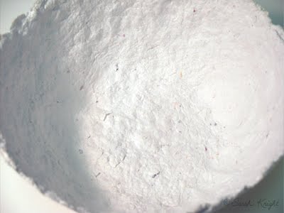
So, these are some shots of some of the new menagerie of bowls in progress...

inside of a small bowl


the inside of a large bowl


another large bowl


I still have to paint trees on them, which is, perhaps, the most tedious part. Trees require the smallest brushes and the most runny paint, and the surface of the inside of the bowls is lumpy... and well, sometimes there are good branches, and sometimes there are accidents, and sometimes nature just takes its course.

To see finished bowls, look here.

"So when you look into the sun
and see the words you could have sung:
It's not too late, only begun.
Look into the sun."
Ian Anderson

Saturday, March 19, 2011

Papermaking

It was a busy week between work and life. Mostly it was a week filled with paper. Technically, given that I draw - most weeks are filled with paper. But this was a week filled with papermaking.

Handmade paper was something I was introduced to in 4-H, which I was involved in as a child.
Anyway, once every couple of years the desire to make something out of paper pulp occurs to me. My renewed activity with this craft happened last summer (as evidenced by this post). And I've been putting the bowls in my etsy shop, and amusingly enough I realized a few weeks ago that my stash of paper bowls was getting really low.

So, like a squirrel with nuts I have been accumulating 'unwanted paper' and tearing it into bits and soaking that in water, so that I can then put it in the blender and make the pulp. And this past week there was a papermaking / bowl moulding extravaganza that took place in Casa Del Knight. And then there were bowls of paper in front of all the heat vents because this is Michigan and it's still cold...

Torn up bits of paper soaking in water.


Pulp!


The bottom of a 'large' bowl.


The unpainted inside.


A stack of unpainted bowls.


And, yes, more bowls.


I have another batch of paper that I need to blend into pulp, but this weekend I think I'm going to try to get some of these painted. Of course, that's the plan, and as one of those free-spirited artsy people — I'm not to spectacular when it comes to staying on plan... so, maybe I'll start or finish some other project, who knows.

To see what bowls look like when they're finished click here.

Have a fun & productive weekend!

Saturday, March 12, 2011

Is it spring yet?

I wish it was — spring. It snowed again this week, the day after we had fog as thick as pea soup (at least, I assume it was as thick as pea soup — I've never had pea soup, I've never really been into peas). So, yes, hey there Weather, I'm ready for spring if you're getting tired or being all wintery.

The calendar indicates that Spring begins on Sunday, 20 March 2011. Living in Michigan — I'm skeptical of this. I suspect it will still snow in April. However, in the spirit of spring, and well, because I was working on cards this week, I've been rifling through my photography.

Last year I decided to take a lot of pictures of the Bradford pear tree blossoms. And so, they sit there in my iphoto, and every now and then I look through them. And a few weeks ago I decided to experiment with the Photoshop, as it were.

When I take pictures, I don't exactly consciously think about all the things that go into an image, like composition, placement, focus, visual focus, balance, color, lighting, atmosphere, oh, and then all those 'photography' concepts. Unconsciously, I'm sure they occur to me. But, a lot of the time when I'm taking pictures the immediate thought is: hey, green focus box, let's come up now, buddy.

When I was taking the pictures of the Bradford pear I wanted close-ups of the blossoms, and was hoping for some cool looking bokeh in the background. The lighting is provided by nature. The best natural light for photography happens in the morning, it changes by the season, but it's after sun-up but before noon. At noon, when the sun is high — the shadows will be severe. When the lighting is atmospheric — the shadows are less severe. Obviously, if you're going for high contrast, then this wouldn't be the lighting for you.

So, yeah, blossom close-ups, bokeh, atmospheric light. My camera is an autofocus, and I just go with that. It's digital, if I don't think it focused the way I wanted, then I can just take more shots from the same angle. I have a memory card and plenty of rechargeable batteries.

The first shot is the original photograph. The second shot is the result of cropping, manual color adjustment, manual brightness adjustment, manual application of a filter, and layering effects.

before


"spring nostalgia" by Sarah Knight
There's something about the way the background blurs, combined with the color palette, and the subject matter that just reminds me of images from long before I was born (yes, I know, to some of you I am so just a kid) but to me the image I created reminds me of sixties photography. You can find "spring nostalgia" in my 'sarahknight' shop on etsy.
----------------------------------------------------------------------------------------------------
Now, on a related but different note...
A large part of my week was consumed by the creation of an Etsy Team: Artists


It's a treasury team for Artists. If you've ever read my etsy profile, you may know that I've been making art since I was a toddler. So, I don't just think of art as paintings, drawings, sculptures, or statues. Photography is art. Collage is art. Prints are art. Illustration is art. I could rail off media all day long, but I think you get the point. Art isn't limited to media that happened to exist in the year 1200. Besides, there's ceramics, fiber art, embroidery, art jewelry, fashion art, domestic arts, etc. So, the Artists team is for folks on etsy who make art & are interested in promoting art through making 'artcentric' treasuries.

If you're interested, then come check us out.
And you can see some of our treasuries here.

Have a fun week, and find some art in something!

Sunday, March 6, 2011

picture story: sublime limelight

"sublime limelight"
salt on watercolor


I did this painting about 3 years ago. Being a "non-day planner" type of girl, there was a period of time in which I made things and didn't bother to date them. It happens quite often. It's kind of funny, because in the context of Art History - if you ever take an Art History class - part of one of your exams will be to memorize the artist, title, and date of a painting. We're all very familiar with "circa," aren't we?

So, this painting is c. 2008.

This painting amuses me. It amuses me, because, technically, it's upside down... and yet it isn't. This painting is from what is quite possibly my second installment of salt on watercolor paintings. The first installment was literally a series of experiments that I did during one of those semesters of Aqueous Media back in college (so, the first installment is c. 2000).

Anyway, the second installment of salt on watercolor paintings came to be as the result of happenstance. My grandmother always buys me some sort of art supplies for Christmas, usually they're kind of cheap, but it's better than getting socks or a sweater (because while I have a ridiculous amount of socks, I do not wear sweaters). So, the paint was just there, and apparently I just happened to have a pad of watercolor paper, and I had just opened an etsy shop, and I was starry-eyed at the concept of selling my stuff and supposed that I should probably try to sell some "original" artwork instead of just prints.

Anyway, the salt on watercolor thing occurred to me as an idea. I mean, I wouldn't become too attached to them, and I could just sell them (ha! I have a a pile of favorites). So, I sat down at the paper cutter and proceeded. They started out as being studies in color like this. But by the time I had gone through the entire pad, they ended up looking more like what I think of as an implicit landscape. Arbitrarily — if it's green on the bottom 20% to 40% of the painting, then it's a landscape. So, that first installment was 50/50 between just being color studies and implicit landscapes. And the piece that I ended up titling "sublime limelight" was kind of a transition point between the color studies and the implicit landscapes.

When I named the paintings, this was one I had to move to the back of the pile, because I had to determine which end was the top - the green or the lavender. Because I had no recollection of which was which from when I painted it, as often there is a lag between the creation of the paintings and me getting around to naming them. It is entirely possible that I have it upside down. Which, again, amuses me.

If it was an implicit landscape, then, yeah, it's upside down. But, I don't think it is. Still, it makes me smile. That and there are technically 3 colors of paint in this painting that aren't so much three colors of paint. The green color might have been almost straight from the tube unaltered color, but the lavender is an amalgam purple color, which was probably derived from some actual purple paint, a bit of any red that happened to be on the palette, and a smidge of cerulean as well as a helping of good old titanium white. This was one of my first unadulterated flings with adding white to my pigments and making them more opaque. You have to look really closely to find the periwinkle color, which occurs primarily because I used salt scraped from other paintings on this one.

And, yes, it is right side up, even if someday 100 years from now some Art Historian tries to insist that it isn't.

Plus, the title is derived from "Limelight" by Rush, which is one of my favorite bands; even if the lyrics of the song really have nothing to do with the content of the painting. Hey, Geddy Lee was my first rockstar crush. Never mind the fact that he's older than both my parents...

Have a lovely week, and remember to find amusement in something.