Showing posts with label artwork. Show all posts

Saturday, April 16, 2011

Picture Story: spring sing

Technically, I was on vacation this week. Vacation, as it turns out was mostly about sleeping and not having to wake up at the sound of an alarm clock. Plus it was about getting some work done on some projects that I have been procrastinating on for a long long time. I am a hell of a procrastinator. But, I did finally take all the snowflakes down — my winter decor consists of my ginormous collection of plastic / resin glitter covered snowflakes (see this post for my hilarious prediction).

Anyway, now I have to hang the butterflies and the hummingbirds... which I just haven't quite gotten to yet.

In the mean time — a picture story: spring sing.
I finished this illustration in the spring of 2009 (see last graphic), but I probably technically started it around 2005. This first graphic is actually a painting. It was painted with acrylics with details done in prismacolor on illustration board. The original is actually 11X14 inches. But via the magic of a scan and a size format change in photoshop it became an 8X10.


What I actually did was I flipped the image horizontally, and then lightened the resized copy of the painting in photoshop and then printed that and drew an outline around everything. Then I scanned that outlined copy and adjusted the file until all I had was the outline on a white background.


When I have an inked copy, then I make a sample fill of every part as a separate layer. So I fill all the tulip flowers with one color, all the petals with one color, the grass, the tree trunks, the leaves, the sky, and the clouds. Because I am going to use scans or paintings or drawings, or digital photos to actually fill in the those parts.


This is a size reformatted portion of a scan of an 11X14 acrylic painting called "geranium sunrise." It's what would eventually become the background of "spring sing." Of course, I had to reformat it 8X10, and then I would go on to lighten the entire painting by creating a layer of white, playing with its opacity and then merging that to the layer of the scan of the painting.


The yellow warblers that appear in the painting were drawn separately. They were drawn with prismacolors. That drawing was scanned, and all the white space was removed. The clouds were created using the paintbrush in photoshop, and then using a layer fill style over the background. The sheet music that appears in the background was scanned, and then manipulated using the warp tool so that it is wavy instead of linear.

The leaves of the trees were created from a digital photo that was manipulated and resized. The original image is actually of maple leaves on the ground. The tree trunks were created from a layer I created by layering several different colors with several different brushes and then using filtering effects in photoshop.

The grass was also created from a photo. It's actually a picture of the grass in my neighbors yard (and this particular photo has been used in a number of my illustrations when I need grass, which I always think is kind of funny since my neighbor will mow his lawn on a diagonal and this shot is clearly of some grass that hasn't yet been cut) . The tulip flowers and leaves were both taken from the same scan that was used for the background.


And through the magic of layering styles all these things come together to create the illustration. You can see the finished piece here in my "sarahkdesigns" shop on Etsy.

If you're anywhere near Tecumseh, Michigan: Friday 29 April 2011 is the annual Tecumseh Art Walk. I'll be at Timeless Stitches, so if you're in town, then please stop by. The event is 6-9pm.

I hope everyone is enjoying their spring : )

Saturday, March 26, 2011

Look into the sun

I think the first song that I truly realized was my favorite song was "Jack and Diane" by John Cougar Mellancamp (because he was JCM back then). Now, I was about 8 years old at the time — 6 years after it came out in 1982. I think I had to ask my Mom what 'Bobbie Brooks' were.

Anyway, by the time I was 11 Pink Floyd was my favorite band. I distinctly remember being on the playground when Lisa & Jessica announced that they had tickets to the New Kids on the Block concert and me realizing that I had to act excited for them. My parents had the good fortune of never having had to take me to a concert. Pink Floyd toured at some point in the early nineties, and believe me - as an adolescent I tried very hard to win the free tickets from the radio station - because I had no money to buy them and my parents sure as hell weren't getting them for me. Usually, when attempting to win tickets I'd just get the busy signal - since the only rock stations were long distance... but there's still something exciting about being caller number 11 when you're 14.

Needless to say, many years later as an adult I shelled out a lot of money to sit in the nosebleed seats to see Roger Waters in concert. And I knew every frigging song.

Anyway, when I was a teenager was when music transitioned from being on cassette tape to CDs. Remember when CDs were the new thing? Yeah, way back when. So, a lot of the first CDs I bought were by this little band you may have heard of: Jethro Tull.

As a teenager who wasn't being 100% contemporary with music, I listened to a lot of classic rock, so I was familiar with the Tull, as it were. And it was around this time that WRIF would occasionally do something over the weekend where they would play the entire catalog of a band in alphabetical order (I remember them doing Rush, Pink Floyd, and Jethro Tull; I'm sure there were others, but those were in my top 10 favorites). So, as someone who wasn't actually alive when all their albums came out - I got to hear their songs...

Anyway, I also bought a lot of Tull CDs because they were an economical $7.99 (at the time I was standing in Best Buy). When you're young and you have no job or allowance and you need to stretch that $20.00 from Grandma - that's like 2 Tull albums or 1 Oasis album plus maybe $6 + change. So, yeah, I own the majority of the Tull catalog.

Why am I rambling on about some old rock band that you may or may not care about? Because when I went on my paper bowl making extravaganza a few weeks ago I pulled out some early Tull on cd and listened to the albums all the way through. Ah, album rock. Particularly "This Was," "Benefit," and "Stand Up."

I've made a lot of artwork while listening to Jethro Tull actually, particularly their early stuff - because those albums just flow and I know every song. Anyway, there's a song on "Benefit" called "Look Into the Sun," and looking at the suns I tend to paint on my bowls reminds me of the song. Plus, I easily have it stuck in my head from listening to it while making the bowls. Oh, circular logic.

Anyway, the sun has always been there in my artwork.
So, these are some shots of some of the new menagerie of bowls in progress...

inside of a small bowl


the inside of a large bowl


another large bowl


I still have to paint trees on them, which is, perhaps, the most tedious part. Trees require the smallest brushes and the most runny paint, and the surface of the inside of the bowls is lumpy... and well, sometimes there are good branches, and sometimes there are accidents, and sometimes nature just takes its course.

To see finished bowls, look here.

"So when you look into the sun
and see the words you could have sung:
It's not too late, only begun.
Look into the sun."
Ian Anderson

Saturday, March 19, 2011

Papermaking

It was a busy week between work and life. Mostly it was a week filled with paper. Technically, given that I draw - most weeks are filled with paper. But this was a week filled with papermaking.

Handmade paper was something I was introduced to in 4-H, which I was involved in as a child.
Anyway, once every couple of years the desire to make something out of paper pulp occurs to me. My renewed activity with this craft happened last summer (as evidenced by this post). And I've been putting the bowls in my etsy shop, and amusingly enough I realized a few weeks ago that my stash of paper bowls was getting really low.

So, like a squirrel with nuts I have been accumulating 'unwanted paper' and tearing it into bits and soaking that in water, so that I can then put it in the blender and make the pulp. And this past week there was a papermaking / bowl moulding extravaganza that took place in Casa Del Knight. And then there were bowls of paper in front of all the heat vents because this is Michigan and it's still cold...

Torn up bits of paper soaking in water.


Pulp!


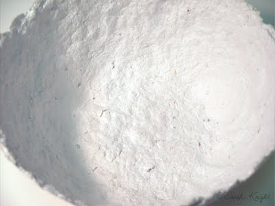
The bottom of a 'large' bowl.


The unpainted inside.


A stack of unpainted bowls.


And, yes, more bowls.


I have another batch of paper that I need to blend into pulp, but this weekend I think I'm going to try to get some of these painted. Of course, that's the plan, and as one of those free-spirited artsy people — I'm not to spectacular when it comes to staying on plan... so, maybe I'll start or finish some other project, who knows.

To see what bowls look like when they're finished click here.

Have a fun & productive weekend!

Sunday, March 6, 2011

picture story: sublime limelight

"sublime limelight"
salt on watercolor


I did this painting about 3 years ago. Being a "non-day planner" type of girl, there was a period of time in which I made things and didn't bother to date them. It happens quite often. It's kind of funny, because in the context of Art History - if you ever take an Art History class - part of one of your exams will be to memorize the artist, title, and date of a painting. We're all very familiar with "circa," aren't we?

So, this painting is c. 2008.

This painting amuses me. It amuses me, because, technically, it's upside down... and yet it isn't. This painting is from what is quite possibly my second installment of salt on watercolor paintings. The first installment was literally a series of experiments that I did during one of those semesters of Aqueous Media back in college (so, the first installment is c. 2000).

Anyway, the second installment of salt on watercolor paintings came to be as the result of happenstance. My grandmother always buys me some sort of art supplies for Christmas, usually they're kind of cheap, but it's better than getting socks or a sweater (because while I have a ridiculous amount of socks, I do not wear sweaters). So, the paint was just there, and apparently I just happened to have a pad of watercolor paper, and I had just opened an etsy shop, and I was starry-eyed at the concept of selling my stuff and supposed that I should probably try to sell some "original" artwork instead of just prints.

Anyway, the salt on watercolor thing occurred to me as an idea. I mean, I wouldn't become too attached to them, and I could just sell them (ha! I have a a pile of favorites). So, I sat down at the paper cutter and proceeded. They started out as being studies in color like this. But by the time I had gone through the entire pad, they ended up looking more like what I think of as an implicit landscape. Arbitrarily — if it's green on the bottom 20% to 40% of the painting, then it's a landscape. So, that first installment was 50/50 between just being color studies and implicit landscapes. And the piece that I ended up titling "sublime limelight" was kind of a transition point between the color studies and the implicit landscapes.

When I named the paintings, this was one I had to move to the back of the pile, because I had to determine which end was the top - the green or the lavender. Because I had no recollection of which was which from when I painted it, as often there is a lag between the creation of the paintings and me getting around to naming them. It is entirely possible that I have it upside down. Which, again, amuses me.

If it was an implicit landscape, then, yeah, it's upside down. But, I don't think it is. Still, it makes me smile. That and there are technically 3 colors of paint in this painting that aren't so much three colors of paint. The green color might have been almost straight from the tube unaltered color, but the lavender is an amalgam purple color, which was probably derived from some actual purple paint, a bit of any red that happened to be on the palette, and a smidge of cerulean as well as a helping of good old titanium white. This was one of my first unadulterated flings with adding white to my pigments and making them more opaque. You have to look really closely to find the periwinkle color, which occurs primarily because I used salt scraped from other paintings on this one.

And, yes, it is right side up, even if someday 100 years from now some Art Historian tries to insist that it isn't.

Plus, the title is derived from "Limelight" by Rush, which is one of my favorite bands; even if the lyrics of the song really have nothing to do with the content of the painting. Hey, Geddy Lee was my first rockstar crush. Never mind the fact that he's older than both my parents...

Have a lovely week, and remember to find amusement in something.

Friday, February 11, 2011

sale at sarahkdesigns

8X10 Print Sale!
2-11-2011 to 2-13-2011
All orders placed during the sale will be shipped on Monday 2-14-2011.
come to SARAHKDESIGNS to view the inventory

-----------------------------------------------------------------------
Yes, I'm having a sale. It's been one of those weeks. I blame the weather. It's been miserably cold here. So basically, every day was: get up just in time to eat dinner, eat dinner, feed the fish, get dressed, drive to work, work 8 hours, drive home, feed the fish, somehow spend 4 hours in front of the computer whilst 'watching' CSI reruns, feed the fish (they're well fed), get to bed an hour late in spite of not really doing anything... and get up to do it all over again... Lather, rinse, repeat.

Yes, it was one of those weeks.
This is my fish Ozzy essentially expressing the word "Meh." He's ready for the warm weather to commence as well...


Hopefully you had a busy (and yet well rested) & accomplishment-filled week.