Showing posts with label sarahknight. Show all posts

Saturday, January 26, 2013

meandering thru January

It's been bitterly cold here lately. It's to be expected, it is January after all and this is Michigan. That means a lot of indoors time. Which either means aimlessly watching tv or procrastinating on projects...

So, I went grocery shopping a couple weeks ago and found myself standing in Hobby Lobby. Don't worry, I don't cook with craft paint. Anyway, I'm a sucker for garden statuary, and low and behold they were setting up that section of the store... so, some critters followed me home. And since this stuff is just mass produced resin - I decided to repaint them to better match my decor and taste...


And then I decided to paint some watercolors. Evidently it's been a while since I had to vacuum salt up off the carpeting. For the uninitiated - you can see my watercolors here. I work with color and salt, and I mix in some gouache for kicks.

I have subsequently named all 22 new paintings, and will eventually get around to scanning them and adding them to the shop... eventually.

At the present moment my stuck-indoors-spree-of-projects has meandered on to working on a series of illustrations. So, I've scanned a bunch of sketches and printed them out as blue pages that I am in the midst of inking...

If you're also stuck indoors, hopefully your time is productive : )

Sunday, April 1, 2012

the cold, the bad, & the ugly...

Remember the last post about the magnolias? Yeah, well, they got their 2 days of blooming and then it was over... the cold front came in, so the thing is one "spectacular mess" now:
However, this week I finished a project I've been working on for a few weeks now, so in order to get some things set up I needed to take some photos of some of my creations... as it turns out, I have taken a lot of crappy product shots. And I have found that the easiest way to get photos that require the least effort and editing is to take them outside in atmospheric light. So, I put on my gloves...
And just because there's a formula or a routine for something doesn't mean they're all spectacular shots... As it turns out, I make things that are difficult to photograph...
 Yes, those are worms. Well, polymer clay worms. What? You're a little grossed out? Ah. Don't be.  That's nature's garbage disposal system right there.  Well, that and less than stellar photos.

Anyway, I make weird things. And you know, we've been to this well before. So, I was standing in Hobby Lobby a few weeks ago in the aisle with all the "wood" stuff, and I picked up these little plaques and laughed and thought "I could make something weird with these." So, I picked through them and bought the 8 that looked good and square.

I had to think about how I was going to execute this project, since I have a tendency to be a little messy.  So I decided the plaques needed to be stained first.  Now, I had also bought these wooden discs a couple weeks prior. They're basically the same thing I use for brooches, except round.  And I'm pretty sure I bought them to use for brooches, but this whole wormhole idea big-footed that.
 So, while my stain was setting, I made my worms.  And then, while finally watching "The Rum Diary" on my first new television in fifteen years - I spackled and primed my wood pieces and added the worms... of course, then I had to wait for that to dry — which is when a week's worth of watercolors began.
Once the spackle was dry, then I added the dirt — which is essentially a combination of acrylic paint with glue and tea grounds, a couple more layers of tea grounds, and an overcoat of a mixture of paint, glue, water, and gloss varnish... and then that has to dry.  And then I sanded the edges of my plaques and gave them another coat of stain... and then painted all the backs white... and then gave the plaques a coat of gloss varnish. So, I still need to take some pictures of them, but, essentially, they're finally done.

Anyway, this frigid weekend part of my photography plans were to change up the pictures for my "bad apples." This is an old shot... Yeah, so basically, I changed the background.
This bad apple is one of my favorites, since they look like they're having a little conversation.
So, the entire photo shoot usually takes place on the back porch.  Either I put a 13X19 inch print out of one of my photos down on the porch steps or I set up a drawing board with the print out across the arms of one of the chairs. Product photography is rarely glamorous.

Anyway, the magnolia is right there next to the porch, so when I was done shooting the worm-work, I took some shots of the magnolia and it's big mess of petals...


 Ironically, real live worms were hard at work.  Of course, since it was cold out, as soon as I picked up the thing they were hiding under, they squirmed their way back to shelter.  Nature is funny like that.

And then it rained. Rain & cold are real impediments to getting photos done and out of the way, so then the project had to move indoors, where between 2 camera let's just say there are less than stellar results...

So, maybe today it won't be too cold or rainy and I can get my shots done. Maybe.

Saturday, March 24, 2012

Outside: magnolia

Magnolia, oh magnolia, you dear dear bush...


As I have mentioned before, here in Michigan when the magnolia finally blooms it then usually immediately snows. So, the bushes look fabulous for about a day, and then they are covered with snow and turn all brown and sad looking... and then all the petals fall off in a spectacular mess.

Well, we had 80˚F weather here for a week in March, so, I got my time with the magnolias.  It is a balmy 53˚F presently as I type this.  It rained during the night and the forecast predicts more rain. So, there-yah-go — we had our brief week of spring, and now it's back to weather as usual.

brief almost connected to the post musical interlude: Grateful Dead "Sugar Magnolia"
I was never a Dead-Head, per se, but "American Beauty" is an album that I happen to own. I'm one of those people who usually buys an album for one or 2 songs, and then eventually ends up listening to the entire thing, and well, I become fond of all the songs.  And "American Beauty" was one of those albums that followed that pattern. I'm pretty sure I probably bought it solely for "Sugar Magnolia." But I became quite fond of "Ripple," "Till the Morning Comes," and "Operator." But actually it was "Box of Rain" that I became completely smitten with. (Oh, and I'm pretty sure everyone has heard "Truckin" and "Friend of the Devil," unless, like, you live under a rock or were born after 1990)

Anyway, I could put "Box of Rain" on repeat for hours, I love that song. So, you know, buy the album, you'll eventually find all the good songs.

Anyway, as it is every year with the magnolias:
—Robert Hunter

Enjoy your weekend!

Saturday, January 21, 2012

ubiquity and tidings of Valentines

This song has no title, just words and a tune... well, okay, actually, it's an Elton John song from "Goodbye Yellow Brick Road." My Mom had that record. It was a double LP, those were a big deal back in the day. "This Song Has No Tittle" is one of my favorites from that album along with "Grey Seal" and "The Ballad of Danny Bailey." Anyway, I like that song and when I thought about presenting another blog entry - it popped into my head.

I'm not a religious person, and I've never taken much stock in the adage that everything happens for a reason. I think there is the explicable and the inexplicable, and someday what was once inexplicable will one day be explained. Time marches on, time stands still... Yeah, I'm one of those people who likes Warren Zevon. We can't all be the same, you know.

Anyway, I tend to come from the camp of thinking that often (but not always) things are relative, and discordant threads can be connected. So, let's give it a whirl, shall we?

I just spent 20 minutes re-working my banner for my etsy shop. If I was a different person, then I might plan to do this stuff and have everything coordinated and whatnot. But that's not me. I looked at the stuff I was working on, I looked at the way stuff was organized in my shop... and I thought it's time for a new banner... since I think I had the current one for like 3 whole weeks. I hear that's like centuries in internet time.
I like internal rhyme, alliteration, assonance, consonance - that kind of stuff. So, after I'd been on etsy for what felt like a century I looked at my one shop and thought "well, this thing needs a name, I guess." I mean, if you go on the etsy forums — a whole gaggle of people will tell you that your shop name is really important or some such thing... but they'll tell you a lot of things.

My shop is actually sarahknight, but I can slap whatever text I want (within the bounds of reason) on the banner. So, I was bored for 10 minutes or whatever, and I thought up "technicolor emporium." It's rhymey & Latinate-ish, the latter part redundantly indicating it's former...

I seem to have dropped the name. It was, after all, just some thing in my banner; some thing that rhymed. But it was there for about a year, and well, the earth didn't stop rotating around the sun, so, well, it is what it is.

I had this idea that I would do the basic design and then just rotate a segment of a painting or a photo in or out for the background. That was the simplest design... and that lasted for about a year. At least it did until I re-formatted the design early this morning. It's the same difference, just without the idea of a name.

I am Sarah Knight, and the items in the shop are what I make. In real life, as opposed to the internet where this isn't surveillance footage, I make a lot of things. But in addition to sleeping, eating, showering, and leaving the house to go to work or the post office or to buy necessities — I make a lot of stuff. I draw, I paint, I take photographs, I make jewelry, I play with sculpey or clay on occasion... and for whatever reason I have a lot of glitter. I did some cleaning recently, and it's always funny to find stuff that you stashed away in some bag or box somewhere... and virtually every time, for whatever reason, there was a tube of glitter. You'd think I'd have something with glitter in the shop... but I don't.

So, I'm back to having an etsy shop with no title. It's just me — sarahknight. Not that anything has changed, really, because I have the same items. I just have a new banner. As I type this it's the second one from the bottom in that graphic. The previous one was the picture of sprinkles. It's a fun picture, but I never formatted it for the shop, and well... I dunno, it's getting on Valentine's Day, so I guess I should act more Valentines-ish.

I like chocolate and chocolates, I think you might have to be suffering from a medical disorder to not like chocolate or candy or sweet things... that's just not normal. But, I'm not a big Valentine's person. So, every year it rolls around, and I'm like, "oh, yeah, that."

This year I decided to make some Valentine's for people like myself slightly less committed to the conventions of Valentine's Day. I wanted to do something with collage, but I got halfway through that project and just kind of stalled into "meh" territory. It sits in a pile next to the paper cutter. Instead, I was cleaning and I have all these old books hanging around, and well, on etsy everyone prints stuff on old book pages. So, I decided to engage my inner hipster and I too would print stuff on old book pages and make Valentines...

As it turns out - my old book was a psychology text book, and the first page I ripped out - almost at random, since my criteria for a page was something with no pictures and mostly text - was about drugs and the brain. It felt ironically humorous, since I was printing the shape of a heart filled with a selection of one of my photos. Hallucinogen Hydrangea was actually the first one I printed. It seemed adroit. It still makes me chuckle. And well, I am that kind of person, I guess. We couldn't all be Martha Stewart or someone's wonderful mother.
People less committed to 19th century poets and Victorian era decor need Valentines too...

So, while watching "The Finder" I glued my hearts to some poster-board that I cut to size and scored and folded, and then added a coat of varnish... and well, they're done. At least I can cross that off the "things I never got around to doing" list.

So, what does that have to do with my banner? Well, that red-winged blackbird photo is on one of my Valentines, since in order to make them I took a little trip down memory lane and sifted through my photos... the rest of it? Maybe not so much.

I changed up the font. I like Century Gothic. I like Coke, I like the color Violet. Pink Floyd is my favorite band, and I wear a lot of black concert t-shirts. Some things are just ubiquitous. But every once in a while you gotta change something up, or everything just turns into background noise.

So, I nixed Technicolor Emporium and picked a new font. I wanted something in a handwriting style. My go-to font is usually Bickley - because it's just a pretty font. But it wasn't fitting the mood... so I picked something different. Font geeks probably know what that's called. Basically, it's fancy, but it's not too pretty or too uniform. Looks a little less like script and a little more like handwriting - the fancy kind.

I'm totally guilty of being a casual devotee of fancy penmanship. For whatever reason I found making letters in certain shapes or styles to be entertaining way back when we were doing primers in elementary school. I'm quite fond of my own handwriting... you can see me being neat and uniform with my penmanship on my name on my business cards:


And you can see my unyielding fondness for Century Gothic. I like Century Gothic mostly for the circle shape of the "o" and the "e" but also for the "a." You see, my name is Sarah, and no one writes an "a" with that goofy little glyph thing on it (except maybe Lisa Bellamy in fifth grade). It's a relic, is really what I'm saying, and I'm not hipster enough to think it's cool.
Anyway, sometimes people being snarky confuse Century Gothic with Helvetica... if you're having one of those moments — look at the "a" and you'll know which it is.

You probably know me as this face... well, also in my shiny new banner - yeah, those are my eyes. Yes, I do have green eyes. No, I'm not Irish, or descended from Irish people. I've eaten too much goulash to hold onto any such inclinations. Mom had green eyes, and so did Grandma Duda (nee Hajos)... of course, it also has something to do with the bey2 gene and the gey gene... Dad had brown eyes, and Grandma Knight has blue eyes. Yes, go make a punnet square now ; )

Anyway, the photo is one of the product shots I took for the lizard barrettes. Yeah, I'm a weird rock'n'roll kind of girl like that.
In the event that you ever wondered...

That's me.
Mind you, it's a blurry shot, and since I'm trying to smile-ish for the photo I have sort of a dumb look on my face. I do not have glamorous teeth; thanks, Mom. So, yeah, I don't go for the toothy grin or the idea of spending $30,000.00 on dental work. And yes, I am wearing a Pink Floyd t-shirt, and my favorite violet colored shirt with the little red flowers on it from the Gap which I bought at a thrift store like more than 10 years ago. Slackers represent.

Anyway, I spent the last couple of hours sifting through photos... it might not have been the most productive night, since other than a new banner and a new potential banner I didn't make anything per se. But well, it's January, and yesterday we had the coldest day so far this winter. Yes, it was a balmy 9˚F here in Michigan. Obviously that's why I scheduled my appointment to get the oil change yesterday. Brrrrrr.

Anyway, I look forward to April or May when it's warm enough to leave the house, because I'll probably go back to the marsh where I took that photo of the red-winged blackbird...

Saturday, July 2, 2011

The lost week...

Sometimes the weekend finally comes and I sit here at my computer and wonder where the last 5-7 days went... and then I remember all the mundane things that ate up my free time. The last two mornings (because I work midnights, and that's what's left when I get home at the end of work) were spent on dentist's appointments. My teeth are clean, have been treated with fluoride, and I now have 1 less wisdom tooth... and now my mouth hurts.

So, if I disappear this weekend or this post seems exceptionally disjointed - that's why.


I made this painting probably about 3 years ago. And I finally got around to listing it on etsy. I also recently used its digital copy in my butterfly project. Which you can see here or in the picture below:


I sample or recycle my own creations a lot, I suppose. I mean, when I painted that painting 3 years ago I wasn't specifically thinking "I'll scan this for this specific project that I plan to do at this date." Because, really, I'm not a plan-on-a-schedule type of girl. I think things happen separately, simultaneously, and often cumulatively. And sometimes that means having an idea, letting it sit there for a long long time, and then finally just doing it.

Long before I finally actually did the butterfly project or painted that painting I was thinking about how cool it would be to decorate with butterflies — like as ornaments — as evidenced by my summer decor from this post. All those monarch butterflies were sort of a preliminary learning curve with photoshop and printing and aligning the front and back of an image on a print so that it could be cut out without any off-set... and that I used fishing line to hang them was probably an due to something from the 3D class from my freshman year at the University of the Arts. We had to build a cube frame out of balsa wood and then fill the cube without gluing anything to the frame - the easiest way to accomplish this was by suspending things with fishing line - which is thin, clear, and almost invisible and made to support X amount of weight...

So, every now and then I think about how nifty it would be to take the idea for the ornaments and convert that into a mobile or a wall hanging... so that's what I'm going to work on this weekend — which is also what's in the last 2 pictures. First I had to line up my images, and now I have to cut them out. Only time will tell how long it takes me to getting around to actually suspending them from something...

Have a good, relaxing, productive weekend — and a Happy 4th of July!

Saturday, April 9, 2011

paper bowls & nbc green is universal contest

So, a couple weeks ago I went on a handmade recycled paper bowl extravaganza...
And I think I made 36 bowls. At least, when I counted the ones I had finished that's the number that I came up with.

Bowls are a process. First the paper has to be torn and soaked in water. Then that has to be blended. Then the paper has to be strained through a screen, then that has to be pressed into a mould. Then, using a wash cloth, as much excess water as possible needs to be pressed out. Then they need to be left alone for a few days to dry. Once they're dry - they need to be painted on the inside, and then that needs a day to dry. And then they need to be painted on the outside, and that takes at least 2 coats and a day to dry... and then the tree needs to be painted.
It's a time consuming process I suppose.

So, anyway, they're all finally done. They've been painted, signed, and dated, and titled...


There's always something strangely anti-climactic about finishing a project. Because, well, now they all sit in 2 piles in my office... as if to remind me that I need to photograph them in order to list them. So, while they're done, there's still more to do.

But they're done. So, now it's time to move onto one of those other 3-5 projects I have been procrastinating on. Ha.

Anyway, there is a contest over at NBC: http://www.greenisuniversal-reuse.com/
Because they're promoting recycling, upcycling, and reuse. So, this is my entry:
http://www.greenisuniversal-reuse.com/home-decor/recycled-handmade-paper-bowl
(that one is also my favorite... well, one of my favorites)

Anyway, I encourage you all to register & vote ; )

Oh, and in the event that no one has ever seen these before - I sell the bowls in my "sarahknight" shop on etsy. You can find them here

Saturday, March 12, 2011

Is it spring yet?

I wish it was — spring. It snowed again this week, the day after we had fog as thick as pea soup (at least, I assume it was as thick as pea soup — I've never had pea soup, I've never really been into peas). So, yes, hey there Weather, I'm ready for spring if you're getting tired or being all wintery.

The calendar indicates that Spring begins on Sunday, 20 March 2011. Living in Michigan — I'm skeptical of this. I suspect it will still snow in April. However, in the spirit of spring, and well, because I was working on cards this week, I've been rifling through my photography.

Last year I decided to take a lot of pictures of the Bradford pear tree blossoms. And so, they sit there in my iphoto, and every now and then I look through them. And a few weeks ago I decided to experiment with the Photoshop, as it were.

When I take pictures, I don't exactly consciously think about all the things that go into an image, like composition, placement, focus, visual focus, balance, color, lighting, atmosphere, oh, and then all those 'photography' concepts. Unconsciously, I'm sure they occur to me. But, a lot of the time when I'm taking pictures the immediate thought is: hey, green focus box, let's come up now, buddy.

When I was taking the pictures of the Bradford pear I wanted close-ups of the blossoms, and was hoping for some cool looking bokeh in the background. The lighting is provided by nature. The best natural light for photography happens in the morning, it changes by the season, but it's after sun-up but before noon. At noon, when the sun is high — the shadows will be severe. When the lighting is atmospheric — the shadows are less severe. Obviously, if you're going for high contrast, then this wouldn't be the lighting for you.

So, yeah, blossom close-ups, bokeh, atmospheric light. My camera is an autofocus, and I just go with that. It's digital, if I don't think it focused the way I wanted, then I can just take more shots from the same angle. I have a memory card and plenty of rechargeable batteries.

The first shot is the original photograph. The second shot is the result of cropping, manual color adjustment, manual brightness adjustment, manual application of a filter, and layering effects.

before


"spring nostalgia" by Sarah Knight
There's something about the way the background blurs, combined with the color palette, and the subject matter that just reminds me of images from long before I was born (yes, I know, to some of you I am so just a kid) but to me the image I created reminds me of sixties photography. You can find "spring nostalgia" in my 'sarahknight' shop on etsy.
----------------------------------------------------------------------------------------------------
Now, on a related but different note...
A large part of my week was consumed by the creation of an Etsy Team: Artists


It's a treasury team for Artists. If you've ever read my etsy profile, you may know that I've been making art since I was a toddler. So, I don't just think of art as paintings, drawings, sculptures, or statues. Photography is art. Collage is art. Prints are art. Illustration is art. I could rail off media all day long, but I think you get the point. Art isn't limited to media that happened to exist in the year 1200. Besides, there's ceramics, fiber art, embroidery, art jewelry, fashion art, domestic arts, etc. So, the Artists team is for folks on etsy who make art & are interested in promoting art through making 'artcentric' treasuries.

If you're interested, then come check us out.
And you can see some of our treasuries here.

Have a fun week, and find some art in something!

Sunday, March 6, 2011

picture story: sublime limelight

"sublime limelight"
salt on watercolor


I did this painting about 3 years ago. Being a "non-day planner" type of girl, there was a period of time in which I made things and didn't bother to date them. It happens quite often. It's kind of funny, because in the context of Art History - if you ever take an Art History class - part of one of your exams will be to memorize the artist, title, and date of a painting. We're all very familiar with "circa," aren't we?

So, this painting is c. 2008.

This painting amuses me. It amuses me, because, technically, it's upside down... and yet it isn't. This painting is from what is quite possibly my second installment of salt on watercolor paintings. The first installment was literally a series of experiments that I did during one of those semesters of Aqueous Media back in college (so, the first installment is c. 2000).

Anyway, the second installment of salt on watercolor paintings came to be as the result of happenstance. My grandmother always buys me some sort of art supplies for Christmas, usually they're kind of cheap, but it's better than getting socks or a sweater (because while I have a ridiculous amount of socks, I do not wear sweaters). So, the paint was just there, and apparently I just happened to have a pad of watercolor paper, and I had just opened an etsy shop, and I was starry-eyed at the concept of selling my stuff and supposed that I should probably try to sell some "original" artwork instead of just prints.

Anyway, the salt on watercolor thing occurred to me as an idea. I mean, I wouldn't become too attached to them, and I could just sell them (ha! I have a a pile of favorites). So, I sat down at the paper cutter and proceeded. They started out as being studies in color like this. But by the time I had gone through the entire pad, they ended up looking more like what I think of as an implicit landscape. Arbitrarily — if it's green on the bottom 20% to 40% of the painting, then it's a landscape. So, that first installment was 50/50 between just being color studies and implicit landscapes. And the piece that I ended up titling "sublime limelight" was kind of a transition point between the color studies and the implicit landscapes.

When I named the paintings, this was one I had to move to the back of the pile, because I had to determine which end was the top - the green or the lavender. Because I had no recollection of which was which from when I painted it, as often there is a lag between the creation of the paintings and me getting around to naming them. It is entirely possible that I have it upside down. Which, again, amuses me.

If it was an implicit landscape, then, yeah, it's upside down. But, I don't think it is. Still, it makes me smile. That and there are technically 3 colors of paint in this painting that aren't so much three colors of paint. The green color might have been almost straight from the tube unaltered color, but the lavender is an amalgam purple color, which was probably derived from some actual purple paint, a bit of any red that happened to be on the palette, and a smidge of cerulean as well as a helping of good old titanium white. This was one of my first unadulterated flings with adding white to my pigments and making them more opaque. You have to look really closely to find the periwinkle color, which occurs primarily because I used salt scraped from other paintings on this one.

And, yes, it is right side up, even if someday 100 years from now some Art Historian tries to insist that it isn't.

Plus, the title is derived from "Limelight" by Rush, which is one of my favorite bands; even if the lyrics of the song really have nothing to do with the content of the painting. Hey, Geddy Lee was my first rockstar crush. Never mind the fact that he's older than both my parents...

Have a lovely week, and remember to find amusement in something.

Thursday, March 3, 2011

plasticity of abstraction

This entry should really just be entitled "write something here." This is the entry that was and wasn't. Because this was the week that was and wasn't. It's winter, it's cold, the drive to work was icy, episodes of CSI were watched, I endeavored into the realm of constructing an idea for a project and then thinking about all the parts that would need to come together for it... I guess I'm still in the middle of that.

So, I was looking around the place for something that I could use for a blog entry. Given the volume of "stuff" I have, this really shouldn't be that difficult, but really, I just want to veg on the couch with the decorative throw and the remote control and do nothing.

So, here it is:


These are not paintings. These are not photos.

There are "artists" who are very much about the "process." I suppose I'm not so much one of them, which is not to say that I lack procedure — just that my procedure is not predicated on buying the most expensive or "professional" tools or media. I will not deny that there is something to be said for quality materials and tools. However, I own one "actual" paint palette (it's a tray for watercolors). Otherwise, every summer I relish in the fact that 'box stores' sell colorful non-microwavable plastic plates as though there is no end to plastic. Yes, I paint off of plastic plates.

The images in this entry are scans of some of the plastic plates I used this summer when I was painting the insides of my recycled paper bowls. In other words, that is the residue from these. I guess I'm not one of those "tidy" people who washes everything down after I use it, otherwise this would have been lost to the sink. I think dried paint looks kind of cool, which, I suppose is part of why I didn't bother to scrape these down or wash them off... that and they're cheap plastic plates, they were like 4 for $2.00 or something, it's not like I would even consider using them for food.

Of course, I just think they look cool. Beauty can be found in the most mundane circumstances.
Now, I should probably actually start working on that project that's floating around in my head before I forget it.

Saturday, February 26, 2011

reflections in watercolor

I am what I am, and I'd probably prefer not to think of myself as what I'm not.
That being said, sometimes I do think about the things that I don't do versus the things that I do happen to do. For instance, I'm not a "painting a day" adherent. I paint when I want to paint, and I don't when I don't. And generally, when I do paint, I tend to make like multiple paintings in a sitting. There's something about making art that needs to be inherent to me, not routine. It's not a this versus that kind of thing, it's just a who I am as a person kind of thing.

So, the thing I like about watercolors isn't so much painting "things" as it is playing with color and being pleasantly surprised. Watercolor (not unlike certain glazing techniques in ceramics) can be a semi-random process. Now, when I get out the paint and the brushes and the water and the salt and sit down, I usually sort of have an idea of what I was maybe thinking about doing, but then it depends on the colors that are already on the palette and then, well, I just sit there and paint and add more color or change colors or get into a mood or a movement and just go with it until there's no more paper or spots on the floor to put paintings to dry...

And it kind of happens like that last sentence - it just goes on until it stops.

I have a good gauge of color, and a reasonable idea of how the colors I have combined are going to look together, and yet, with my watercolor paintings there is always an element of surprise. And that's kind of the kismet of the thing: making something and being certain in knowing that the outcome isn't exact and yet it will probably be fantastically interesting.

With every batch of paintings I do, I always have favorites, this is one of them:

raspberry misty morning rain


Now, for the person who asked on the comments of my last entry:
"...wonder if you would tell me what you use salt for and what it does?"
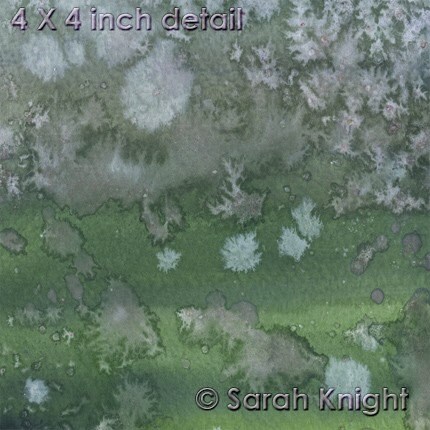
When you apply salt to wet watercolor pigment it creates the 'fractal' effect you can see in the bottom half of that painting. See this detail. Basically, the salt crystals play with the pigment and the water and leave little 'star' patterns. For a matter of amusement, you may also notice that rock salt when dried on a sidewalk will also leave a similar pattern.

Now, if you look this up on watercolor painting tutorials it will tell you about creating stars or snowflakes or lichen or something. Let's just say I have a heavy hand with the salt and a heavy hand with the pigment — because I scrape my salt off with an old gift card, and always either wear sunglasses or avert my eyes when I do it. Safety first; that and my eyes are important.

There's a semi-amusing thing about this series of paintings (at least, to me there is) because when I had started painting I had the fleeting thought that I wasn't going to end up going full bore with the salt and that I was going to try to do something more oriented with droplets of pigment.... that didn't happen. I mean, the next painting I did was mostly based in white pigment, but by the time I had finished the rest of the paintings the next morning - everything was salted. This is probably why I don't "plan" things.

I suppose not planning in some respects can be construed as lowering the bar; so as to not have to suffer the indignity of not meeting expectations... but, I mean, as conceited as maybe this sounds, when I sit down to make something I do always expect it to be damned awesome. You know, it's not like I'm thinking "oh, this is going to suck." But really, when I sit down to do watercolors, I did kind of already know what I was going to do, I just like to let things take their course. As it turns out, I made 15 paintings that got progressively more salty as I went along. And I'm pretty happy with how all of them turned out.

Slowly, but surely, my new paintings will pop up here... (except for a couple of my favorites, which I just can't part with)

Sunday, February 20, 2011

weekend watercolors

I came home from work this weekend, and maybe in my mind I had constructed elaborate plans (well, I "planned" to work on a project). But then, I started vacuuming instead. I even went so far as to clean the bathroom. So, apparently, there was a part of my brain that decided against working on the project — because the project was certainly not house work...

So, I watched some tv and did some painting instead - watercolors. Now, I have this project floating around in my imagination that involves combing watercolors with prints, and I have a mental fascination with a certain technique with gouache... but neither of those were on the itinerary. Nope, this was straight up salt on watercolor.


I had watercolor sets when I was a kid - the kind with the little circles filled with paint in a neat little container. But I remember using markers more. To fulfill some sort of "painting" requirement for my BFA - I took "Aqueous Media" (2 semesters, no less). So, somewhere in my portfolio there are watercolors of pumpkins and nude people (although, oddly, no pumpkins with nude people, heh). And while I could do minimal color combinations just fine (only orange & blue, or purple & yellow, or red & green) well, I don't see the world in terms of "complimentary colors" and I never have. I see the idea of complimentary colors as being arbitrary. So, yeah, it was an exercise in aqueous media (which, btw, could have just been called "watercolors", it wasn't exactly like we did anything with gouache).

What I do distinctly remember was being told that we should avoid using the color black. when rendering shadows, and to just kind of avoid using black in general. I also remember thinking that "don't use black" thing was both stupid and absurd. I took "Aqueous Media" to fulfill a painting requirement in college, specifically because I didn't want to take "Painting" which, if I recall correctly, was mostly oil painting, which is something that has never held any charm for me. I really do think that portraiture in museums, particularly anything meant to be realistically representational is duller than absolute boredom. I didn't take Aqueous Media because I wanted to learn how to make watercolor paintings that looked like I had mastered "watercolor techniques" — I took it to avoid taking another class & to fulfill a requirement. Plus, watercolor paint & supplies were cheaper than oil painting supplies...

I've been drawing since I was 2 (or so says my Mother). Art is something that came inherently (unlike playing the piano or poker). So, my approach has always been to do it like a savant, not to grab a book and read a tutorial. Although I went to college where my actual skills were refined (which doesn't mean that I refused to learn anything or anything new there) - I didn't take Aqueous Media to learn how to make watercolors that are supposed to look like "watercolors." So, when I read things like this on wikipedia, I laugh; particularly the last paragraph.

While I did the exercises in Aqueous Media, they were just that: exercises.

Anyway, every time I pull out the watercolors and inevitably squeeze some black pigment out of the tube - I think of being told that I shouldn't and just inwardly chuckle. Rules, schmules.

So, I got out the tray (purchased on the basis of the supply list for Aqueous Media) which is always covered with dried paint. I filled up a faux tupperware bowl with some tap water (because it's not like I see the act of painting in ceremonial terms - any bowl that holds enough water will do). Got out the kleenex box full out paintbrushes which hangs around in various places. Put a fresh sheet of newsprint down on the paper cutter. Got the elaborate bowl I made in one of many semesters of ceramics which holds my salt (regular table salt mixed with sea salt mixed with used salt scraped off of previous paintings). And, of course, got out the paints, and sat down on the floor and commenced with the painting while watching the Simpsons on hulu & CSI reruns from onDemand.

The paintings sit on the floor to dry. And then I wait impatiently for paint to dry, and chuckle inwardly at the idea of waiting for paint to dry... And when they are finally dry, then I take an old gift card and scrape the salt off them (and then collect the salt debris and add it back to the bowl; the bowl sits on a shelf in front of a pile of art theory books along with a decorative resin turtle).

Watercolors - particularly the abstract nature of salt on watercolor - are always an interesting surprise, which is part of the appeal. There is a difference between the way the piece looks when the paint is still wet and how it appear when it's dry (particularly because I use a lot of color and I always use the "white" watercolor, which alters the opacity of the colors). As a general rule (and this isn't like the don't use black) - watercolors will dry darker and duller.

I suppose the paintings I make are perhaps an acquired taste or a specific taste, because, in all likelihood, I am never going to be one of those people who is compelled to make intricate photo realistic paintings with watercolor. And yet, through medium and technique, my paintings are intricate and meticulous even with all the factors of chance and happenstance. There is the combination of what is inherent and entropy.

There is no other painting medium (or pastels or colored pencils) that is going to produce this visual. In the end the painting is a painting, it is a visual thing.

You can check out some of my watercolors on my "sarahknight" shop on etsy.

Saturday, February 5, 2011

snow pictorial

So, yeah, it snowed... again.


I tried to have a sense of humor about it, I suppose. But really, now I hate snow. I've had enough. I don't want to spend any more time shoveling the driveway or that part in front of the mail box... or an extra half an hour driving to work, and another extra half an hour driving home. I really just want it to stop.

In the mean time, I suppose, I have hot chocolate and animal crackers. But really, I'm just ready for spring. (as recent additions to my "sarahknight" etsy shop can attest)
••∞•∞•∞••

Oh, but on a non-snow related note: I now have a Tumblr
You can find me at: http://sunshinesight.tumblr.com/

I'm still a technophobe, so honestly, I'm not quite sure what exactly the point of tumblr is. It seems like a middle point between twitter and a blog. Still, don't expect to find any nude photos there or anything.
••∞•∞•∞••
On an optimistic note:
  • new episode of "Supernatural" this week (a + that it wasn't pre-empted)
  • FX reruns "Archer" at 11pm on Saturdays - so I can actually watch it
  • my socks are all folded (so now I don't have to pick through the pile to find 2 that match)
  • Brett Dennen has a catchy new song which I keep getting stuck in my head.
  • Found Zachary mellowcreme "valentine mix" when I was browsing the Holiday candy aisle - yum