Showing posts with label salt on watercolor. Show all posts

Wednesday, March 21, 2012

so beautiful or so what

So beautiful or So what? So, I'm a little behind on my musical releases... that's just kind of how I am. You know what? I didn't go out and buy skinny jeans whenever those became "stylish" again. It is what it is. Right now I have this song —  so beautiful or so what — stuck in my head. So, that's so what.
Truth be told, I just took a shower. So, as I type this I'm waiting for my hair to dry.  Normally, I default to TRESemmé shampoo and Pantene conditioner.  I'm a creature of habit. But every once in a while one must be adventurous, or just wash all the residue out of one's hair. So, I liked the way this smelled. Yes, as a consumer of hair care products, these 2 Herbal Essences products had all the necessary marketing tricks:
√  purple stuff comes out of the bottle
√  the bottle is purple
√  alleges to smell like "wild cherry"
√  use of the word "orchid"

Okay, so I actually think it kind of smells like grapes. But, well, it made my hair all snazzy when I used it. In the event that it's not apparent — violet (and by proxy all purple derivatives) is my favorite color. I love cherries, and I have long curly hair.
I also like cake. Strawberry with cream cheese frosting... mostly because that's what I found in the cupboards. Mmm, cake.
I decided, on a whim, that I wanted to do some watercolors... which might have something to do with the sudden influx of watercolors to my sarahknight etsy shop.  You know, when I list them I have to leaf through the pile and make sure that I've scanned them, and then I'm probably day dreaming about my fantasy house with all my paintings on the wall or something.
Anyway, yesterday  when I got home from work I sat down and caught up on the last 2 episodes of Californication and cleared off a good area on the floor in order to get out my case of paints, the box of watercolors, the box of gouache, the set of gouaches, the watercolor palette, the gouache palette, the bowl of salt... and then I spent a good 10 minutes cleaning up paintbrushes so that I would have something with which to fling wet pigment at the parchment...

I highly recommend Californication as a series.  I always enjoy being surprised by the plot twists on this show... and like Hank, I can't exactly say I have any fondness for Tyler...
I painted 14 yesterday, and four so far today. And now I'm waiting for them to dry. That's probably the hardest part.  There's a difference between the way they look when they're wet and how they look when they're dry. And even though I've been using this painting technique for 12 years — there's always an element of surprise, and it's usually the good kind.  I already scraped the salt off the 14 I painted yesterday, and it's going to be hard to not put most of them in the "keep pile."
Some notable keep pile escapees... here, and here, and here, and here...

It's unseasonably warm here in Michigan right now. A couple days ago I got my bike out of the shed and pumped up the tires. The first ride after the winter lay off is always the toughest... anyway, the crocuses have already bloomed, and now the daffodils, the forsythia, and the magnolia are going at it. I'm convinced it's going to snow tomorrow, even if the calendar indicates that spring has now begun.


Anyway, I recommend having a nice slice of cake and then going out to wander about and look at all the springy things popping up here and there... and maybe catch up on some Paul Simon too.
: )

Saturday, February 25, 2012

Picture Story: snow hootenanny

 "snow hootenanny" is another image that I created for the calendar. I actually began the original sketch in August whilst sitting at the Art Walk and biding my time. So, one would think that maybe it would have been finished as an illustration in a timely fashion... nah.
Like all the calendar graphics for this year - this one came right up to the deadline as well.

So, this is the original sketch.

And, as per the usual, I scanned the sketch, converted it to a blue page, printed that out, inked it, and scanned it back in to Photoshop and began editing it for fills...

 However, I was not enamored with my owl.  It was just too belabored and stiff and trying to be symmetrical... So, I printed out a light copy of my trees and sketched some new owls over top of that.  And then I scanned that sketch, edited it, and printed it out so that I could color it...

The thing that I remember most about coloring the owls is that I was watching "My Soul to Take." Yes, heh-heh, while I was coloring a family of owls for a whimsical owl illustration I was watching a horror movie.  It happens a lot, as that is my preferred genre of movies.
So, anyway, I colored my owls and scanned them, and cut the scan all during the span of that movie.

Now, I needed some trees. I suppose I could have just colored the bark by hand. But that isn't what I had in mind.  In the spring, summer, and fall, I go into town and wander around and take all manner of photos.  And as I've mentioned before, I photograph all sorts of things - not necessarily with the intent that those are glamorous photos that need to be printed out and hung on the wall - but because I can use the content to fill in some part of a future illustration.
So, the owls are sitting on sycamore branches via the magic of photoshop: layer rotation and the rubber stamp tool. Yes, this is what the file tends to look like when I'm creating a fill from a photo (or several photos).

overcast orchid rain
The picture needed a background. So, I selection one of my watercolor paintings, and added the digital scan as a layer.  This was one of the salt on watercolor / gouache paintings - so it has both the salt crystal effect and dabs of white gouache spattered across it. Overall, it looks kinda snowy, so it was perfect.
Anyway, I added it to the picture and then adjusted the color to something more bluish - because I wanted the picture to have a cool wintery tone.

The next step was to add snowflakes.  Now there are actually 2 separate layers of snowflakes in this picture.  The snowflakes at the top of the picture were derived from all the snowflakes I design for Christmas cards. In fact, the layer used in this picture came from the file that I make the snowstorm backgrounds.

Now, the snowflakes on the bottom of the picture — and yes, there is actually a layer of snowflakes super-imposed over the bottom half of the picture — came from a different source: Winterwood.
Yes, the picture I used as the graphic for February on the calendar 2 years ago, which, yes, is named after the Don McLean song — that I happen to be very fond of. Anyway - I made a layer of snowflakes for the bottom of that picture - and decided to use them in "snow hootenanny" too.
 
So, all those parts come together to make the whole: sketches, drawings, salt on watercolor painting, photo walks, scary movies, colored pencils, ink pens, and snowflakes...

Sunday, August 7, 2011

ice cream, birds, and watercolors...

It was another hot week here in Michigan. Yes, I'm ready for fall. I'm ready for 60—70˚F weather. I'm ready for cool crisp mornings and cold dew on my car... but it isn't fall yet, it's just August.

So, in the mean time, I recommend sitting down and having a nice big bowl of ice cream every now and then. The greatest ice cream I have discovered this summer is Hudsonville's Orange Cream Swirl. If you remember or have recently had an orange creamsicle — it's like that translated into a tub of ice cream. It's delicious. Oh, and so is orange sherbet. Yes, I love that stuff.

Since I was drawing birds a few weekends ago, I decided to format some new pictures for sarahkdesigns:

say's phoebe | cedar waxwing
male northern cardinal | female northern cardinal


And then I worked on watercolors this week... which means I got out the salt, and the watercolors, and the gouache, and the brushes, and the paper, and conveniently used the empty tub from my orange sherbet to hold the water...

And after I use the salt I scrape it off the painting and reuse it... which is interesting, because sometimes it's covered in pigment and that transfers to the next painting.


details of some of the paintings of this week

And yes, I finally bought gouache. And decided to use it with my watercolors (although I did keep it on its own shiny new separate paint palette). I'm heavy handed with the pigment anyway - but it was interesting to see the white actually stay white when it dried.
(And for anyone uninitiated with my watercolor paintings - you can see the actual paintings here)

It's hard to explain making something abstract when you're not the stereotypical character archetype artist. I don't see the world through some narrow prism, and I don't think there's only one path to some ideal visual. When I sit down on the floor in front of the paper cutter with my paint and water and salt and brushes and paper - I have a vague idea of what I think maybe I'm going to do. But really, to a certain extent - whatever happens happens. And when I'm finally done putting paint on the paper or sprinkling it with salt - when I pick that wet painting up and set it down on the carpet to dry — I know it that when it dries it will look different from how it appears wet. Some of the salt will melt, some of the colors will run, pigment will be absorbed or overpowered by other pigment... and while some of it is knowable, there's a certain mystery and randomness to it.

So, the wet paintings sit there on the floor and I go to bed. And usually they're dry when I get up. And when I come home from work the next morning I scrape the salt off them and get to actually see the final result, which is the cool part. Because there's painting it and playing with color and juxtaposition and all that, and then there's finally seeing what it really looks like.

And then I have to sit there and name them all. Because, let's face it, I don't just ever paint one painting. Don't get me wrong, I like the paintings, but I can't imagine setting all that stuff up and having to vacuum salt off the carpeting for one painting.

Of course, I still have to do that vacuuming part.

So, stay cool and have some of your favorite ice cream : )

Friday, June 24, 2011

butterflies

I think everyone has a romanticized version of themselves. Like if you had to define yourself as a person - the words that you would choose are a projection of the qualities that you desire... and to some extent every person thinks: I defy labels. Really, we don't, but we all think that.

Labels, of course, are subjective.

So, what I know is that I probably have little use for "the rules," whatever those might be. If you've visited this blog semi-regularly, you may have noticed that there is a lack of format (which, unless you have OCD and you check here daily) is due largely to the fact that I do a blog entry when I actually have something to share, as opposed to having a format.

I don't desire to abide by a format in my free time, which I consider this blog to be. Formats are just like rules, and usually they're kind of arbitrary and eventually they get boring or feel like an obligation. Obligations come with expectations and guilt, particularly when expectations aren't met... and I like to avoid that. Formats also involve a time table and repetition. I'm not really a format kind of girl.

When I was a child I had a lot of toys, particularly Barbies and Cabbage Patch Kids. And one day I was downstairs playing in the Barbie Section (that was the name of the area in the basement that had been apportioned to me & my sister as a play area) and realized that I had no desire to be a doctor or a lawyer or an astronaut (or whatever the third rung of that analogy is supposed to be). My childhood ambition was either to be a princess or a hairdresser...

I mean, I styled a lot of doll hair, and I had all the latest dolls from Herself the Elf, Rose Petal, Hot Looks dolls, Strawberry Shortcake, She-Ra dolls, Golden Girls (not the sitcom), Barbies, Maxie dolls (like Barbie), Jem and the Holograms... some of those probably also account for my princess aspirations (besides the fact that princesses had pretty dresses)... Anyway, I am neither a princess or a hairdresser.

I'm not a goal-obsessed person. That's probably why I got that art degree.

So, every now and then an idea for a 'thing' will pop into my head. And I may write it down or draw it in the back of my sketchbook, or I might not. And if I just remember it - that's fine.

So, for a long long time I had this idea about a project with butterflies, and really, I didn't sit down and meticulously plan out the details... I just finally did it. So, one Saturday morning one of the showtime channels was playing "Ripple Effect" and I sat there and sketched out butterfly wings... and realized that I think that Forest Whitaker plays phenomenally annoying characters (yes, I've seen the Criminal Minds spin-off).

And eventually, I scanned those and inked them, and scanned those, and made a 'body' and then 'antenna'... and piece by piece, slowly, and perhaps organically the project finally came together. And I realize that I tend to think of my work in process terms - like I scanned that, inked that, etc — because generally, those are the givens. The colors, the shape, the composition — I think of those as simply being inherent and I suppose, beyond explanation...

And sometimes I think things have amusing and unintentional parallels and connections. Because to 'colorize' the butterflies — I used scans of my watercolor paintings. And perhaps, when you were a child you had a watercolor set and made a butterfly by painting half and then folding the paper in half and pressing it together. I don't remember ever having done that at home — I actually only remember doing it in the fourth grade...

But then, I paint watercolors that don't follow "the rules." According to the rules - if you use some sort of gimmick - like salt on watercolor - you should do it sparingly, just in an area or something. Oh, pfft to that thinking.

When I paint with watercolors, other than knowing that I will be using paint, salt, water, paper, and a brush — I don't plan my compositions — they happen. It is what it is, which must be very wrong to the people who will tell you that there are rules...

So, I finally finished* the butterfly project that I've been thinking about for about a year now.
*finished is a relative term.


morning dew fairywing

rose madder majestic

morning aurora swallowtail

You can see the rest of them at my sarahkdesigns shop as they trickle into the butterfly section.
I suppose if I had planned it and put it on a time table - it would have been done a long time ago. But, that's just not how I work.

Now, since this is the last day of my 'vacation' — let's see which new project gets my last day of vacation, so I'm relaxed and focused attention. Will it be the calendar graphics, the bird project, the dancers, the 'portraits,' the watercolor over photographs, or the girls? Or, maybe I'll finish cleaning the living room. Okay, yeah, the living room probably isn't going to win that one.

Have a lovely weekend, and do whatever is going to make you happy : )

Sunday, March 6, 2011

picture story: sublime limelight

"sublime limelight"
salt on watercolor


I did this painting about 3 years ago. Being a "non-day planner" type of girl, there was a period of time in which I made things and didn't bother to date them. It happens quite often. It's kind of funny, because in the context of Art History - if you ever take an Art History class - part of one of your exams will be to memorize the artist, title, and date of a painting. We're all very familiar with "circa," aren't we?

So, this painting is c. 2008.

This painting amuses me. It amuses me, because, technically, it's upside down... and yet it isn't. This painting is from what is quite possibly my second installment of salt on watercolor paintings. The first installment was literally a series of experiments that I did during one of those semesters of Aqueous Media back in college (so, the first installment is c. 2000).

Anyway, the second installment of salt on watercolor paintings came to be as the result of happenstance. My grandmother always buys me some sort of art supplies for Christmas, usually they're kind of cheap, but it's better than getting socks or a sweater (because while I have a ridiculous amount of socks, I do not wear sweaters). So, the paint was just there, and apparently I just happened to have a pad of watercolor paper, and I had just opened an etsy shop, and I was starry-eyed at the concept of selling my stuff and supposed that I should probably try to sell some "original" artwork instead of just prints.

Anyway, the salt on watercolor thing occurred to me as an idea. I mean, I wouldn't become too attached to them, and I could just sell them (ha! I have a a pile of favorites). So, I sat down at the paper cutter and proceeded. They started out as being studies in color like this. But by the time I had gone through the entire pad, they ended up looking more like what I think of as an implicit landscape. Arbitrarily — if it's green on the bottom 20% to 40% of the painting, then it's a landscape. So, that first installment was 50/50 between just being color studies and implicit landscapes. And the piece that I ended up titling "sublime limelight" was kind of a transition point between the color studies and the implicit landscapes.

When I named the paintings, this was one I had to move to the back of the pile, because I had to determine which end was the top - the green or the lavender. Because I had no recollection of which was which from when I painted it, as often there is a lag between the creation of the paintings and me getting around to naming them. It is entirely possible that I have it upside down. Which, again, amuses me.

If it was an implicit landscape, then, yeah, it's upside down. But, I don't think it is. Still, it makes me smile. That and there are technically 3 colors of paint in this painting that aren't so much three colors of paint. The green color might have been almost straight from the tube unaltered color, but the lavender is an amalgam purple color, which was probably derived from some actual purple paint, a bit of any red that happened to be on the palette, and a smidge of cerulean as well as a helping of good old titanium white. This was one of my first unadulterated flings with adding white to my pigments and making them more opaque. You have to look really closely to find the periwinkle color, which occurs primarily because I used salt scraped from other paintings on this one.

And, yes, it is right side up, even if someday 100 years from now some Art Historian tries to insist that it isn't.

Plus, the title is derived from "Limelight" by Rush, which is one of my favorite bands; even if the lyrics of the song really have nothing to do with the content of the painting. Hey, Geddy Lee was my first rockstar crush. Never mind the fact that he's older than both my parents...

Have a lovely week, and remember to find amusement in something.

Saturday, February 26, 2011

reflections in watercolor

I am what I am, and I'd probably prefer not to think of myself as what I'm not.
That being said, sometimes I do think about the things that I don't do versus the things that I do happen to do. For instance, I'm not a "painting a day" adherent. I paint when I want to paint, and I don't when I don't. And generally, when I do paint, I tend to make like multiple paintings in a sitting. There's something about making art that needs to be inherent to me, not routine. It's not a this versus that kind of thing, it's just a who I am as a person kind of thing.

So, the thing I like about watercolors isn't so much painting "things" as it is playing with color and being pleasantly surprised. Watercolor (not unlike certain glazing techniques in ceramics) can be a semi-random process. Now, when I get out the paint and the brushes and the water and the salt and sit down, I usually sort of have an idea of what I was maybe thinking about doing, but then it depends on the colors that are already on the palette and then, well, I just sit there and paint and add more color or change colors or get into a mood or a movement and just go with it until there's no more paper or spots on the floor to put paintings to dry...

And it kind of happens like that last sentence - it just goes on until it stops.

I have a good gauge of color, and a reasonable idea of how the colors I have combined are going to look together, and yet, with my watercolor paintings there is always an element of surprise. And that's kind of the kismet of the thing: making something and being certain in knowing that the outcome isn't exact and yet it will probably be fantastically interesting.

With every batch of paintings I do, I always have favorites, this is one of them:

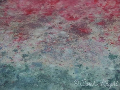
raspberry misty morning rain


Now, for the person who asked on the comments of my last entry:
"...wonder if you would tell me what you use salt for and what it does?"
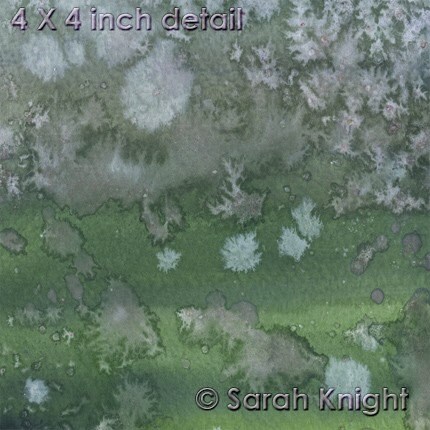
When you apply salt to wet watercolor pigment it creates the 'fractal' effect you can see in the bottom half of that painting. See this detail. Basically, the salt crystals play with the pigment and the water and leave little 'star' patterns. For a matter of amusement, you may also notice that rock salt when dried on a sidewalk will also leave a similar pattern.

Now, if you look this up on watercolor painting tutorials it will tell you about creating stars or snowflakes or lichen or something. Let's just say I have a heavy hand with the salt and a heavy hand with the pigment — because I scrape my salt off with an old gift card, and always either wear sunglasses or avert my eyes when I do it. Safety first; that and my eyes are important.

There's a semi-amusing thing about this series of paintings (at least, to me there is) because when I had started painting I had the fleeting thought that I wasn't going to end up going full bore with the salt and that I was going to try to do something more oriented with droplets of pigment.... that didn't happen. I mean, the next painting I did was mostly based in white pigment, but by the time I had finished the rest of the paintings the next morning - everything was salted. This is probably why I don't "plan" things.

I suppose not planning in some respects can be construed as lowering the bar; so as to not have to suffer the indignity of not meeting expectations... but, I mean, as conceited as maybe this sounds, when I sit down to make something I do always expect it to be damned awesome. You know, it's not like I'm thinking "oh, this is going to suck." But really, when I sit down to do watercolors, I did kind of already know what I was going to do, I just like to let things take their course. As it turns out, I made 15 paintings that got progressively more salty as I went along. And I'm pretty happy with how all of them turned out.

Slowly, but surely, my new paintings will pop up here... (except for a couple of my favorites, which I just can't part with)

Sunday, February 20, 2011

weekend watercolors

I came home from work this weekend, and maybe in my mind I had constructed elaborate plans (well, I "planned" to work on a project). But then, I started vacuuming instead. I even went so far as to clean the bathroom. So, apparently, there was a part of my brain that decided against working on the project — because the project was certainly not house work...

So, I watched some tv and did some painting instead - watercolors. Now, I have this project floating around in my imagination that involves combing watercolors with prints, and I have a mental fascination with a certain technique with gouache... but neither of those were on the itinerary. Nope, this was straight up salt on watercolor.


I had watercolor sets when I was a kid - the kind with the little circles filled with paint in a neat little container. But I remember using markers more. To fulfill some sort of "painting" requirement for my BFA - I took "Aqueous Media" (2 semesters, no less). So, somewhere in my portfolio there are watercolors of pumpkins and nude people (although, oddly, no pumpkins with nude people, heh). And while I could do minimal color combinations just fine (only orange & blue, or purple & yellow, or red & green) well, I don't see the world in terms of "complimentary colors" and I never have. I see the idea of complimentary colors as being arbitrary. So, yeah, it was an exercise in aqueous media (which, btw, could have just been called "watercolors", it wasn't exactly like we did anything with gouache).

What I do distinctly remember was being told that we should avoid using the color black. when rendering shadows, and to just kind of avoid using black in general. I also remember thinking that "don't use black" thing was both stupid and absurd. I took "Aqueous Media" to fulfill a painting requirement in college, specifically because I didn't want to take "Painting" which, if I recall correctly, was mostly oil painting, which is something that has never held any charm for me. I really do think that portraiture in museums, particularly anything meant to be realistically representational is duller than absolute boredom. I didn't take Aqueous Media because I wanted to learn how to make watercolor paintings that looked like I had mastered "watercolor techniques" — I took it to avoid taking another class & to fulfill a requirement. Plus, watercolor paint & supplies were cheaper than oil painting supplies...

I've been drawing since I was 2 (or so says my Mother). Art is something that came inherently (unlike playing the piano or poker). So, my approach has always been to do it like a savant, not to grab a book and read a tutorial. Although I went to college where my actual skills were refined (which doesn't mean that I refused to learn anything or anything new there) - I didn't take Aqueous Media to learn how to make watercolors that are supposed to look like "watercolors." So, when I read things like this on wikipedia, I laugh; particularly the last paragraph.

While I did the exercises in Aqueous Media, they were just that: exercises.

Anyway, every time I pull out the watercolors and inevitably squeeze some black pigment out of the tube - I think of being told that I shouldn't and just inwardly chuckle. Rules, schmules.

So, I got out the tray (purchased on the basis of the supply list for Aqueous Media) which is always covered with dried paint. I filled up a faux tupperware bowl with some tap water (because it's not like I see the act of painting in ceremonial terms - any bowl that holds enough water will do). Got out the kleenex box full out paintbrushes which hangs around in various places. Put a fresh sheet of newsprint down on the paper cutter. Got the elaborate bowl I made in one of many semesters of ceramics which holds my salt (regular table salt mixed with sea salt mixed with used salt scraped off of previous paintings). And, of course, got out the paints, and sat down on the floor and commenced with the painting while watching the Simpsons on hulu & CSI reruns from onDemand.

The paintings sit on the floor to dry. And then I wait impatiently for paint to dry, and chuckle inwardly at the idea of waiting for paint to dry... And when they are finally dry, then I take an old gift card and scrape the salt off them (and then collect the salt debris and add it back to the bowl; the bowl sits on a shelf in front of a pile of art theory books along with a decorative resin turtle).

Watercolors - particularly the abstract nature of salt on watercolor - are always an interesting surprise, which is part of the appeal. There is a difference between the way the piece looks when the paint is still wet and how it appear when it's dry (particularly because I use a lot of color and I always use the "white" watercolor, which alters the opacity of the colors). As a general rule (and this isn't like the don't use black) - watercolors will dry darker and duller.

I suppose the paintings I make are perhaps an acquired taste or a specific taste, because, in all likelihood, I am never going to be one of those people who is compelled to make intricate photo realistic paintings with watercolor. And yet, through medium and technique, my paintings are intricate and meticulous even with all the factors of chance and happenstance. There is the combination of what is inherent and entropy.

There is no other painting medium (or pastels or colored pencils) that is going to produce this visual. In the end the painting is a painting, it is a visual thing.

You can check out some of my watercolors on my "sarahknight" shop on etsy.

Sunday, January 23, 2011

this post is "not exciting"

I do a lot of things that I could only describe as "not exciting." And I spent the weekend doing "not exciting" things. While painting is fun, there is something ironically rewarding about the part right after the painting where I'm sitting there in my living room waiting for paint to dry while chuckling at the idea of waiting for paint to dry and trying not to act impatient about it... it's downright existential.

It'd be one thing if I was going to keep them all for myself, because, well, then I could just leave them be until I got around to framing them... but that's not how it works when you want to sell the things that you've made to other people.

So, I spent the weekend doing the "not exciting" task of burning files off my desktop onto cds in order to make more room on my desktop to scan my paintings... which in the circle of life will eventually need to be burned to disc so I can make more room for new things on the desktop. It's really quite "not exciting." But it is time consuming.

Yesterday I scanned, edited, and saved 13 watercolors (not unlike the detail pictured below), and this morning I scanned in 20 acrylic paintings. The thing about both of these endeavors is that the paintings are larger than the scanner bed so they have to be scanned in two parts and then I have to align those parts and mesh them together...

Are you bored to tears yet? ; )

(this is a little snippet from "astral indigo")


Yeah, it's not exciting (the post-painting process stuff), believe me. It's time consuming, but definitely not exciting.

Anyway, I have a project percolating in the back of my mind... something about doing watercolor painting over a print. I sat down this morning and sketched up a prototype for the "print" portion of this endeavor while finally watching the Johnny Depp version of "Alice in Wonderland." I like Johnny Depp. I can't say I'm an uber-Depp fan or anything, because I've never seen any of those Pirate movies (nor have I ever been able to convince or force myself to watch "What's eating Gilbert Grape") - but I do generally enjoy anything Johnny Depp or Tim Burton. So, yes, I know, I'm way late to the party when it comes to finally watching Alice on dvd (which I think has been hanging around the living room since at least September)... but somehow, this weekend was just right for it. Besides, my other movie choice involved homicidal clowns... apparently I was just not down with the idea of killer clowns this weekend.

Time will tell if I get on this current project - and finish it. Ironically, the acrylic paintings I scanned in this weekend were painted 4 years ago. I made them for a project that I just never quite got around to finishing... and now, I suppose, it's time to let them go. Eventually, they will appear in my "sarahknight" shop on etsy... that is, of course, after I type up the listings, calculate the shipping, and format graphics for the listings.

Yes, the painting part happens so fast... it's the post-painting activities that draw this out.

In the mean time, I look forward to season 2 of "Archer" this week. It's apparently my new favorite show. I caught a little marathon of it on FX a while back and I was smitten. Plus, new episodes of "Supernatural" return this week. And "Fringe" is back from the abyss of mid-season reruns and whatever happens to tv shows when they disappear in the middle of the holidays. Yes, I have the tv likes of a geeky college student, I know. I'm just not ready to start watching "Nova" yet...

I hope you have something keeping you busy during these dreadfully cold January days.

Saturday, May 30, 2009

Picture Story: 2 bunnies on a hill -- sarahkdesigns

"2 bunnies on a hill" available at sarahkdesigns


I draw, so I tend to think that the picture stands on its own. I'm just adroit like that. I suppose if I was in the business of using words to illustrate, then I would be a writer...

"2 bunnies on a hill" was made for one of my calendars. Every year I spend three weeks before Christmas putting together the calendar that I had vowed would already be done. (This happens every year: I get everything done at the last minute and vow that won’t happen next year… it always does, no matter how early I start).

Anyway, I make the calendar for my family: parents, grandparents, sister, aunts, uncle, etc. So, while I may be a slacker twenty-something who wears black t-shirts and maryjanes and listens to Pink Floyd… well, that’s not my Grandma. So, the calendar has to be family friendly, because I expect my relatives to hang this up somewhere and show it off.

I also like the calendar to be seasonally appropriate. We all live in the Midwest, so we have all 4 seasons. “2 bunnies on a hill” was originally created for the April slot of my 2006 calendar. And it did not look the way it does now when I had originally finished it.


This was one of my early digital collages. Digital collage was a technique that I fell into way back when I was working on a comic book. Since the comic I was working on was supposed to be black and white and I knew it would be printed digitally, I wanted to do something anathema to comics: incorporate texture! So, I spent a lot of time back then scanning pen & ink drawings and filling them with scans of photos or magazine clippings or scans of objects… Anyway, the 2006 calendar was my first to feature digital collages instead of just reproductions of my drawings or paintings. Ah, modern technology.

So, the “drawn” portion of the image literally actually is just the 2 bunnies and the silhouette of the hill. Everything else is present due to the magic of photoshop. The grass was created in a series of layers using the “grass” brush in photoshop. I just kept changing the size of the brush. I started small at the top of the hill and got progressively larger by the bottom of the page. Then I think I ran the layer through a filter.

The sky was created from a scan of one of my older salt on watercolor paintings. It was back in 2000 or 2001 when I started doing abstract salt on watercolor paintings. I did a series of them for an aqueous media class, this was one of them. Anyway, I scanned the painting and flipped it over on itself with layer styles. So, if you look closely you might notice that one side kind of mirrors the other. I think I also put a color layer over the altered scan of the painting.

The stars were created using the shape tool. They are also “filled” with portions of a scan of salt on watercolor, although it reads more faintly. I wanted the coloration of the stars to be like those glow in the dark stars that they sell in toy stores. I always thought those were nifty. I had a few of them as a teenager.

The fill of the bunnies was recycled from a comic book project. And that fill has been used in many of my digital collages. The original file for the fill was created from a scan of a picture in a magazine. It was actually a rug on the floor in the picture. Anyway, I scanned it, and copied and pasted and rotated parts of it, and used the clone stamp tool until I had what amounted to a much larger sampling of “rug” (or curlyfur.jpeg as it is known in my files). It’s original purpose as a fill was supposed to be (ironically) for a demonic rabbit.

Anyhow, when I was deciding what I wanted in my etsy shop I decided to go back and revisit what was originally known simply as “April.psd”. I think I wanted something purple. As it turns out, violet is my favorite color. So, I decided to liven up the sky with a wash of purple and periwinkle that mirrored the shape of the hill. And for consistency and color relationships, I decided to change up the color of the grass; making it a more olive shade of green and lighter at the top of the hill.

I’ve certainly been surprised at how many prints of this image that I have sold : )