Saturday, April 16, 2011

Picture Story: spring sing

Technically, I was on vacation this week. Vacation, as it turns out was mostly about sleeping and not having to wake up at the sound of an alarm clock. Plus it was about getting some work done on some projects that I have been procrastinating on for a long long time. I am a hell of a procrastinator. But, I did finally take all the snowflakes down — my winter decor consists of my ginormous collection of plastic / resin glitter covered snowflakes (see this post for my hilarious prediction).

Anyway, now I have to hang the butterflies and the hummingbirds... which I just haven't quite gotten to yet.

In the mean time — a picture story: spring sing.
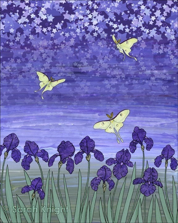
I finished this illustration in the spring of 2009 (see last graphic), but I probably technically started it around 2005. This first graphic is actually a painting. It was painted with acrylics with details done in prismacolor on illustration board. The original is actually 11X14 inches. But via the magic of a scan and a size format change in photoshop it became an 8X10.


What I actually did was I flipped the image horizontally, and then lightened the resized copy of the painting in photoshop and then printed that and drew an outline around everything. Then I scanned that outlined copy and adjusted the file until all I had was the outline on a white background.


When I have an inked copy, then I make a sample fill of every part as a separate layer. So I fill all the tulip flowers with one color, all the petals with one color, the grass, the tree trunks, the leaves, the sky, and the clouds. Because I am going to use scans or paintings or drawings, or digital photos to actually fill in the those parts.


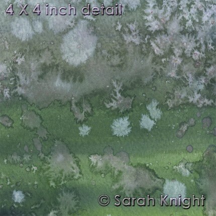
This is a size reformatted portion of a scan of an 11X14 acrylic painting called "geranium sunrise." It's what would eventually become the background of "spring sing." Of course, I had to reformat it 8X10, and then I would go on to lighten the entire painting by creating a layer of white, playing with its opacity and then merging that to the layer of the scan of the painting.


The yellow warblers that appear in the painting were drawn separately. They were drawn with prismacolors. That drawing was scanned, and all the white space was removed. The clouds were created using the paintbrush in photoshop, and then using a layer fill style over the background. The sheet music that appears in the background was scanned, and then manipulated using the warp tool so that it is wavy instead of linear.

The leaves of the trees were created from a digital photo that was manipulated and resized. The original image is actually of maple leaves on the ground. The tree trunks were created from a layer I created by layering several different colors with several different brushes and then using filtering effects in photoshop.

The grass was also created from a photo. It's actually a picture of the grass in my neighbors yard (and this particular photo has been used in a number of my illustrations when I need grass, which I always think is kind of funny since my neighbor will mow his lawn on a diagonal and this shot is clearly of some grass that hasn't yet been cut) . The tulip flowers and leaves were both taken from the same scan that was used for the background.


And through the magic of layering styles all these things come together to create the illustration. You can see the finished piece here in my "sarahkdesigns" shop on Etsy.

If you're anywhere near Tecumseh, Michigan: Friday 29 April 2011 is the annual Tecumseh Art Walk. I'll be at Timeless Stitches, so if you're in town, then please stop by. The event is 6-9pm.

I hope everyone is enjoying their spring : )

Saturday, April 9, 2011

paper bowls & nbc green is universal contest

So, a couple weeks ago I went on a handmade recycled paper bowl extravaganza...
And I think I made 36 bowls. At least, when I counted the ones I had finished that's the number that I came up with.

Bowls are a process. First the paper has to be torn and soaked in water. Then that has to be blended. Then the paper has to be strained through a screen, then that has to be pressed into a mould. Then, using a wash cloth, as much excess water as possible needs to be pressed out. Then they need to be left alone for a few days to dry. Once they're dry - they need to be painted on the inside, and then that needs a day to dry. And then they need to be painted on the outside, and that takes at least 2 coats and a day to dry... and then the tree needs to be painted.
It's a time consuming process I suppose.

So, anyway, they're all finally done. They've been painted, signed, and dated, and titled...


There's always something strangely anti-climactic about finishing a project. Because, well, now they all sit in 2 piles in my office... as if to remind me that I need to photograph them in order to list them. So, while they're done, there's still more to do.

But they're done. So, now it's time to move onto one of those other 3-5 projects I have been procrastinating on. Ha.

Anyway, there is a contest over at NBC: http://www.greenisuniversal-reuse.com/
Because they're promoting recycling, upcycling, and reuse. So, this is my entry:
http://www.greenisuniversal-reuse.com/home-decor/recycled-handmade-paper-bowl
(that one is also my favorite... well, one of my favorites)

Anyway, I encourage you all to register & vote ; )

Oh, and in the event that no one has ever seen these before - I sell the bowls in my "sarahknight" shop on etsy. You can find them here

Wednesday, March 30, 2011

weekend watercolors

On a leisurely Saturday a few weeks ago I sat down with the remainder of a pad of watercolor paper and got out my watercolors and a couple bottles of acrylic paint and sat down on the floor in front of the paper cutter. I had this idea floating around in my head that I wanted to experiment with mixing some very watered-down acrylic paint with my watercolor pigment and see what happened. You know, there's a first time for everything.

I also finally got around to watching "Shutter" from the OnDemand menu. "Shutter" was one of those movies that when I saw the preview commercials on tv — I was like "oh, I want to see! that" Of course, I never get around to actually going to the movies. So, either I'll see it 5 years later at 2am sometime on cable, or maybe I'll find the dvd bin at Walmart. So, yes, there it was on the OnDemand menu, beckoning me. I like horror movies and well, I watch Joshua Jackson as Peter on"Fringe" (which is an awesome tv series).

So, I sat down in front of the papercutter with my paints and began experimenting. For the most part, I kept the two types of pigment completely separate from one another until I had them on the paper. Most of the acrylic paint I was using was either white or a milky sage green color. So, there was a sort of pastel / spring feel to all the paintings. Plus the other colors I was using were blue / periwinkle / purple / rose colored, so there wasn't like red or orange or anything dark or citrusy. The colors are saturated, and yet the tones are muted... at least — that's what I think of as "muted."

I suppose it's kind of strange to know that I make such colorful springy paintings while watching scary movies...

As usual, I sat down and named them. And generally, this is when I realize there are a couple of them that I can just never part with... and those end up is a special pile.
And sometimes when some time has passed and I'm sitting there listing them I think "really, this didn't end up in the keep pile?"

This is one of the ones that I'd probably rather keep. Of course, purple is my favorite color : )

“midnight plum phantasmagoria”


Saturday, March 26, 2011

Look into the sun

I think the first song that I truly realized was my favorite song was "Jack and Diane" by John Cougar Mellancamp (because he was JCM back then). Now, I was about 8 years old at the time — 6 years after it came out in 1982. I think I had to ask my Mom what 'Bobbie Brooks' were.

Anyway, by the time I was 11 Pink Floyd was my favorite band. I distinctly remember being on the playground when Lisa & Jessica announced that they had tickets to the New Kids on the Block concert and me realizing that I had to act excited for them. My parents had the good fortune of never having had to take me to a concert. Pink Floyd toured at some point in the early nineties, and believe me - as an adolescent I tried very hard to win the free tickets from the radio station - because I had no money to buy them and my parents sure as hell weren't getting them for me. Usually, when attempting to win tickets I'd just get the busy signal - since the only rock stations were long distance... but there's still something exciting about being caller number 11 when you're 14.

Needless to say, many years later as an adult I shelled out a lot of money to sit in the nosebleed seats to see Roger Waters in concert. And I knew every frigging song.

Anyway, when I was a teenager was when music transitioned from being on cassette tape to CDs. Remember when CDs were the new thing? Yeah, way back when. So, a lot of the first CDs I bought were by this little band you may have heard of: Jethro Tull.

As a teenager who wasn't being 100% contemporary with music, I listened to a lot of classic rock, so I was familiar with the Tull, as it were. And it was around this time that WRIF would occasionally do something over the weekend where they would play the entire catalog of a band in alphabetical order (I remember them doing Rush, Pink Floyd, and Jethro Tull; I'm sure there were others, but those were in my top 10 favorites). So, as someone who wasn't actually alive when all their albums came out - I got to hear their songs...

Anyway, I also bought a lot of Tull CDs because they were an economical $7.99 (at the time I was standing in Best Buy). When you're young and you have no job or allowance and you need to stretch that $20.00 from Grandma - that's like 2 Tull albums or 1 Oasis album plus maybe $6 + change. So, yeah, I own the majority of the Tull catalog.

Why am I rambling on about some old rock band that you may or may not care about? Because when I went on my paper bowl making extravaganza a few weeks ago I pulled out some early Tull on cd and listened to the albums all the way through. Ah, album rock. Particularly "This Was," "Benefit," and "Stand Up."

I've made a lot of artwork while listening to Jethro Tull actually, particularly their early stuff - because those albums just flow and I know every song. Anyway, there's a song on "Benefit" called "Look Into the Sun," and looking at the suns I tend to paint on my bowls reminds me of the song. Plus, I easily have it stuck in my head from listening to it while making the bowls. Oh, circular logic.

Anyway, the sun has always been there in my artwork.
So, these are some shots of some of the new menagerie of bowls in progress...

inside of a small bowl


the inside of a large bowl


another large bowl


I still have to paint trees on them, which is, perhaps, the most tedious part. Trees require the smallest brushes and the most runny paint, and the surface of the inside of the bowls is lumpy... and well, sometimes there are good branches, and sometimes there are accidents, and sometimes nature just takes its course.

To see finished bowls, look here.

"So when you look into the sun
and see the words you could have sung:
It's not too late, only begun.
Look into the sun."
Ian Anderson

Saturday, March 19, 2011

Papermaking

It was a busy week between work and life. Mostly it was a week filled with paper. Technically, given that I draw - most weeks are filled with paper. But this was a week filled with papermaking.

Handmade paper was something I was introduced to in 4-H, which I was involved in as a child.
Anyway, once every couple of years the desire to make something out of paper pulp occurs to me. My renewed activity with this craft happened last summer (as evidenced by this post). And I've been putting the bowls in my etsy shop, and amusingly enough I realized a few weeks ago that my stash of paper bowls was getting really low.

So, like a squirrel with nuts I have been accumulating 'unwanted paper' and tearing it into bits and soaking that in water, so that I can then put it in the blender and make the pulp. And this past week there was a papermaking / bowl moulding extravaganza that took place in Casa Del Knight. And then there were bowls of paper in front of all the heat vents because this is Michigan and it's still cold...

Torn up bits of paper soaking in water.


Pulp!


The bottom of a 'large' bowl.


The unpainted inside.


A stack of unpainted bowls.


And, yes, more bowls.


I have another batch of paper that I need to blend into pulp, but this weekend I think I'm going to try to get some of these painted. Of course, that's the plan, and as one of those free-spirited artsy people — I'm not to spectacular when it comes to staying on plan... so, maybe I'll start or finish some other project, who knows.

To see what bowls look like when they're finished click here.

Have a fun & productive weekend!

Saturday, March 12, 2011

Is it spring yet?

I wish it was — spring. It snowed again this week, the day after we had fog as thick as pea soup (at least, I assume it was as thick as pea soup — I've never had pea soup, I've never really been into peas). So, yes, hey there Weather, I'm ready for spring if you're getting tired or being all wintery.

The calendar indicates that Spring begins on Sunday, 20 March 2011. Living in Michigan — I'm skeptical of this. I suspect it will still snow in April. However, in the spirit of spring, and well, because I was working on cards this week, I've been rifling through my photography.

Last year I decided to take a lot of pictures of the Bradford pear tree blossoms. And so, they sit there in my iphoto, and every now and then I look through them. And a few weeks ago I decided to experiment with the Photoshop, as it were.

When I take pictures, I don't exactly consciously think about all the things that go into an image, like composition, placement, focus, visual focus, balance, color, lighting, atmosphere, oh, and then all those 'photography' concepts. Unconsciously, I'm sure they occur to me. But, a lot of the time when I'm taking pictures the immediate thought is: hey, green focus box, let's come up now, buddy.

When I was taking the pictures of the Bradford pear I wanted close-ups of the blossoms, and was hoping for some cool looking bokeh in the background. The lighting is provided by nature. The best natural light for photography happens in the morning, it changes by the season, but it's after sun-up but before noon. At noon, when the sun is high — the shadows will be severe. When the lighting is atmospheric — the shadows are less severe. Obviously, if you're going for high contrast, then this wouldn't be the lighting for you.

So, yeah, blossom close-ups, bokeh, atmospheric light. My camera is an autofocus, and I just go with that. It's digital, if I don't think it focused the way I wanted, then I can just take more shots from the same angle. I have a memory card and plenty of rechargeable batteries.

The first shot is the original photograph. The second shot is the result of cropping, manual color adjustment, manual brightness adjustment, manual application of a filter, and layering effects.

before


"spring nostalgia" by Sarah Knight
There's something about the way the background blurs, combined with the color palette, and the subject matter that just reminds me of images from long before I was born (yes, I know, to some of you I am so just a kid) but to me the image I created reminds me of sixties photography. You can find "spring nostalgia" in my 'sarahknight' shop on etsy.
----------------------------------------------------------------------------------------------------
Now, on a related but different note...
A large part of my week was consumed by the creation of an Etsy Team: Artists


It's a treasury team for Artists. If you've ever read my etsy profile, you may know that I've been making art since I was a toddler. So, I don't just think of art as paintings, drawings, sculptures, or statues. Photography is art. Collage is art. Prints are art. Illustration is art. I could rail off media all day long, but I think you get the point. Art isn't limited to media that happened to exist in the year 1200. Besides, there's ceramics, fiber art, embroidery, art jewelry, fashion art, domestic arts, etc. So, the Artists team is for folks on etsy who make art & are interested in promoting art through making 'artcentric' treasuries.

If you're interested, then come check us out.
And you can see some of our treasuries here.

Have a fun week, and find some art in something!

Sunday, March 6, 2011

picture story: sublime limelight

"sublime limelight"
salt on watercolor


I did this painting about 3 years ago. Being a "non-day planner" type of girl, there was a period of time in which I made things and didn't bother to date them. It happens quite often. It's kind of funny, because in the context of Art History - if you ever take an Art History class - part of one of your exams will be to memorize the artist, title, and date of a painting. We're all very familiar with "circa," aren't we?

So, this painting is c. 2008.

This painting amuses me. It amuses me, because, technically, it's upside down... and yet it isn't. This painting is from what is quite possibly my second installment of salt on watercolor paintings. The first installment was literally a series of experiments that I did during one of those semesters of Aqueous Media back in college (so, the first installment is c. 2000).

Anyway, the second installment of salt on watercolor paintings came to be as the result of happenstance. My grandmother always buys me some sort of art supplies for Christmas, usually they're kind of cheap, but it's better than getting socks or a sweater (because while I have a ridiculous amount of socks, I do not wear sweaters). So, the paint was just there, and apparently I just happened to have a pad of watercolor paper, and I had just opened an etsy shop, and I was starry-eyed at the concept of selling my stuff and supposed that I should probably try to sell some "original" artwork instead of just prints.

Anyway, the salt on watercolor thing occurred to me as an idea. I mean, I wouldn't become too attached to them, and I could just sell them (ha! I have a a pile of favorites). So, I sat down at the paper cutter and proceeded. They started out as being studies in color like this. But by the time I had gone through the entire pad, they ended up looking more like what I think of as an implicit landscape. Arbitrarily — if it's green on the bottom 20% to 40% of the painting, then it's a landscape. So, that first installment was 50/50 between just being color studies and implicit landscapes. And the piece that I ended up titling "sublime limelight" was kind of a transition point between the color studies and the implicit landscapes.

When I named the paintings, this was one I had to move to the back of the pile, because I had to determine which end was the top - the green or the lavender. Because I had no recollection of which was which from when I painted it, as often there is a lag between the creation of the paintings and me getting around to naming them. It is entirely possible that I have it upside down. Which, again, amuses me.

If it was an implicit landscape, then, yeah, it's upside down. But, I don't think it is. Still, it makes me smile. That and there are technically 3 colors of paint in this painting that aren't so much three colors of paint. The green color might have been almost straight from the tube unaltered color, but the lavender is an amalgam purple color, which was probably derived from some actual purple paint, a bit of any red that happened to be on the palette, and a smidge of cerulean as well as a helping of good old titanium white. This was one of my first unadulterated flings with adding white to my pigments and making them more opaque. You have to look really closely to find the periwinkle color, which occurs primarily because I used salt scraped from other paintings on this one.

And, yes, it is right side up, even if someday 100 years from now some Art Historian tries to insist that it isn't.

Plus, the title is derived from "Limelight" by Rush, which is one of my favorite bands; even if the lyrics of the song really have nothing to do with the content of the painting. Hey, Geddy Lee was my first rockstar crush. Never mind the fact that he's older than both my parents...

Have a lovely week, and remember to find amusement in something.

Thursday, March 3, 2011

plasticity of abstraction

This entry should really just be entitled "write something here." This is the entry that was and wasn't. Because this was the week that was and wasn't. It's winter, it's cold, the drive to work was icy, episodes of CSI were watched, I endeavored into the realm of constructing an idea for a project and then thinking about all the parts that would need to come together for it... I guess I'm still in the middle of that.

So, I was looking around the place for something that I could use for a blog entry. Given the volume of "stuff" I have, this really shouldn't be that difficult, but really, I just want to veg on the couch with the decorative throw and the remote control and do nothing.

So, here it is:


These are not paintings. These are not photos.

There are "artists" who are very much about the "process." I suppose I'm not so much one of them, which is not to say that I lack procedure — just that my procedure is not predicated on buying the most expensive or "professional" tools or media. I will not deny that there is something to be said for quality materials and tools. However, I own one "actual" paint palette (it's a tray for watercolors). Otherwise, every summer I relish in the fact that 'box stores' sell colorful non-microwavable plastic plates as though there is no end to plastic. Yes, I paint off of plastic plates.

The images in this entry are scans of some of the plastic plates I used this summer when I was painting the insides of my recycled paper bowls. In other words, that is the residue from these. I guess I'm not one of those "tidy" people who washes everything down after I use it, otherwise this would have been lost to the sink. I think dried paint looks kind of cool, which, I suppose is part of why I didn't bother to scrape these down or wash them off... that and they're cheap plastic plates, they were like 4 for $2.00 or something, it's not like I would even consider using them for food.

Of course, I just think they look cool. Beauty can be found in the most mundane circumstances.
Now, I should probably actually start working on that project that's floating around in my head before I forget it.

Saturday, February 26, 2011

reflections in watercolor

I am what I am, and I'd probably prefer not to think of myself as what I'm not.
That being said, sometimes I do think about the things that I don't do versus the things that I do happen to do. For instance, I'm not a "painting a day" adherent. I paint when I want to paint, and I don't when I don't. And generally, when I do paint, I tend to make like multiple paintings in a sitting. There's something about making art that needs to be inherent to me, not routine. It's not a this versus that kind of thing, it's just a who I am as a person kind of thing.

So, the thing I like about watercolors isn't so much painting "things" as it is playing with color and being pleasantly surprised. Watercolor (not unlike certain glazing techniques in ceramics) can be a semi-random process. Now, when I get out the paint and the brushes and the water and the salt and sit down, I usually sort of have an idea of what I was maybe thinking about doing, but then it depends on the colors that are already on the palette and then, well, I just sit there and paint and add more color or change colors or get into a mood or a movement and just go with it until there's no more paper or spots on the floor to put paintings to dry...

And it kind of happens like that last sentence - it just goes on until it stops.

I have a good gauge of color, and a reasonable idea of how the colors I have combined are going to look together, and yet, with my watercolor paintings there is always an element of surprise. And that's kind of the kismet of the thing: making something and being certain in knowing that the outcome isn't exact and yet it will probably be fantastically interesting.

With every batch of paintings I do, I always have favorites, this is one of them:

raspberry misty morning rain


Now, for the person who asked on the comments of my last entry:
"...wonder if you would tell me what you use salt for and what it does?"
When you apply salt to wet watercolor pigment it creates the 'fractal' effect you can see in the bottom half of that painting. See this detail. Basically, the salt crystals play with the pigment and the water and leave little 'star' patterns. For a matter of amusement, you may also notice that rock salt when dried on a sidewalk will also leave a similar pattern.

Now, if you look this up on watercolor painting tutorials it will tell you about creating stars or snowflakes or lichen or something. Let's just say I have a heavy hand with the salt and a heavy hand with the pigment — because I scrape my salt off with an old gift card, and always either wear sunglasses or avert my eyes when I do it. Safety first; that and my eyes are important.

There's a semi-amusing thing about this series of paintings (at least, to me there is) because when I had started painting I had the fleeting thought that I wasn't going to end up going full bore with the salt and that I was going to try to do something more oriented with droplets of pigment.... that didn't happen. I mean, the next painting I did was mostly based in white pigment, but by the time I had finished the rest of the paintings the next morning - everything was salted. This is probably why I don't "plan" things.

I suppose not planning in some respects can be construed as lowering the bar; so as to not have to suffer the indignity of not meeting expectations... but, I mean, as conceited as maybe this sounds, when I sit down to make something I do always expect it to be damned awesome. You know, it's not like I'm thinking "oh, this is going to suck." But really, when I sit down to do watercolors, I did kind of already know what I was going to do, I just like to let things take their course. As it turns out, I made 15 paintings that got progressively more salty as I went along. And I'm pretty happy with how all of them turned out.

Slowly, but surely, my new paintings will pop up here... (except for a couple of my favorites, which I just can't part with)

Sunday, February 20, 2011

weekend watercolors

I came home from work this weekend, and maybe in my mind I had constructed elaborate plans (well, I "planned" to work on a project). But then, I started vacuuming instead. I even went so far as to clean the bathroom. So, apparently, there was a part of my brain that decided against working on the project — because the project was certainly not house work...

So, I watched some tv and did some painting instead - watercolors. Now, I have this project floating around in my imagination that involves combing watercolors with prints, and I have a mental fascination with a certain technique with gouache... but neither of those were on the itinerary. Nope, this was straight up salt on watercolor.


I had watercolor sets when I was a kid - the kind with the little circles filled with paint in a neat little container. But I remember using markers more. To fulfill some sort of "painting" requirement for my BFA - I took "Aqueous Media" (2 semesters, no less). So, somewhere in my portfolio there are watercolors of pumpkins and nude people (although, oddly, no pumpkins with nude people, heh). And while I could do minimal color combinations just fine (only orange & blue, or purple & yellow, or red & green) well, I don't see the world in terms of "complimentary colors" and I never have. I see the idea of complimentary colors as being arbitrary. So, yeah, it was an exercise in aqueous media (which, btw, could have just been called "watercolors", it wasn't exactly like we did anything with gouache).

What I do distinctly remember was being told that we should avoid using the color black. when rendering shadows, and to just kind of avoid using black in general. I also remember thinking that "don't use black" thing was both stupid and absurd. I took "Aqueous Media" to fulfill a painting requirement in college, specifically because I didn't want to take "Painting" which, if I recall correctly, was mostly oil painting, which is something that has never held any charm for me. I really do think that portraiture in museums, particularly anything meant to be realistically representational is duller than absolute boredom. I didn't take Aqueous Media because I wanted to learn how to make watercolor paintings that looked like I had mastered "watercolor techniques" — I took it to avoid taking another class & to fulfill a requirement. Plus, watercolor paint & supplies were cheaper than oil painting supplies...

I've been drawing since I was 2 (or so says my Mother). Art is something that came inherently (unlike playing the piano or poker). So, my approach has always been to do it like a savant, not to grab a book and read a tutorial. Although I went to college where my actual skills were refined (which doesn't mean that I refused to learn anything or anything new there) - I didn't take Aqueous Media to learn how to make watercolors that are supposed to look like "watercolors." So, when I read things like this on wikipedia, I laugh; particularly the last paragraph.

While I did the exercises in Aqueous Media, they were just that: exercises.

Anyway, every time I pull out the watercolors and inevitably squeeze some black pigment out of the tube - I think of being told that I shouldn't and just inwardly chuckle. Rules, schmules.

So, I got out the tray (purchased on the basis of the supply list for Aqueous Media) which is always covered with dried paint. I filled up a faux tupperware bowl with some tap water (because it's not like I see the act of painting in ceremonial terms - any bowl that holds enough water will do). Got out the kleenex box full out paintbrushes which hangs around in various places. Put a fresh sheet of newsprint down on the paper cutter. Got the elaborate bowl I made in one of many semesters of ceramics which holds my salt (regular table salt mixed with sea salt mixed with used salt scraped off of previous paintings). And, of course, got out the paints, and sat down on the floor and commenced with the painting while watching the Simpsons on hulu & CSI reruns from onDemand.

The paintings sit on the floor to dry. And then I wait impatiently for paint to dry, and chuckle inwardly at the idea of waiting for paint to dry... And when they are finally dry, then I take an old gift card and scrape the salt off them (and then collect the salt debris and add it back to the bowl; the bowl sits on a shelf in front of a pile of art theory books along with a decorative resin turtle).

Watercolors - particularly the abstract nature of salt on watercolor - are always an interesting surprise, which is part of the appeal. There is a difference between the way the piece looks when the paint is still wet and how it appear when it's dry (particularly because I use a lot of color and I always use the "white" watercolor, which alters the opacity of the colors). As a general rule (and this isn't like the don't use black) - watercolors will dry darker and duller.

I suppose the paintings I make are perhaps an acquired taste or a specific taste, because, in all likelihood, I am never going to be one of those people who is compelled to make intricate photo realistic paintings with watercolor. And yet, through medium and technique, my paintings are intricate and meticulous even with all the factors of chance and happenstance. There is the combination of what is inherent and entropy.

There is no other painting medium (or pastels or colored pencils) that is going to produce this visual. In the end the painting is a painting, it is a visual thing.

You can check out some of my watercolors on my "sarahknight" shop on etsy.

Thursday, February 17, 2011

yes, it's a bird feeder

It's February in Michigan. And while the weather has temporarily calmed down — you know, it was a balmy 39˚F out yesterday — the scenery is still maybe a little bleak, or maybe I'm a little short on time to go wander around and take better photos.

There is a project that I started on 10 years ago that I never finished, and I'm engrossed in it at the moment. Every couple of years I return to this project, so time will tell if this is the time I actually just do it — finish it.

In the mean time, because I am a professional procrastinator, I finally put out some bird food. Well, that and as I said: t was a balmy 39˚F outside. Sorry birds, but when it's freezing it's just too damned cold for me to feed you — fly South.

Anyway, the crop of regulars showed up. There is a lone black-capped chickadee, the house finches, the gold finches, assorted sparrows, and the juncos.


Juncos are amusing birds. I've heard that they don't eat off of feeders - but that they scrounge around on the ground under the feeder. That was exactly what I saw when a small flock of them showed up yesterday. But they're making progress, at least one of them is. If the goldfinches and house finches can do it, then the juncos can learn it too (as evidenced by the last photo).

Sunday, February 13, 2011

I like stuff

Wikipedia could probably tell you all about the history of Valentines Day... and Google probably could point you in the direction. Admittedly, I'm not really a history buff. That doesn't mean that I hate facts, I'm just indifferent to some things.

Valentine's Day is about that heart shaped box of chocolates, and seeing pink and red and white and hearts everywhere. It's trying to remember expressions of love... it's not quite as much of an "invented" holiday as "Sweetest Day," but it's about consumerism nonetheless.

I'm a participating consumer; otherwise I'm indifferent to the concept of consumerism, because it's just not something I spend a lot of time thinking about. I buy groceries, I buy stuff, hell, I even like stuff. I distinctly remember my seventh grade English teacher telling us that "stuff" is a dead word. But well, *eyeroll,* that hasn't ever stopped me from using it.

I like stuff. Yes, I said it: I like stuff. I mean, you know, if you've looked at any of my previous entries then you may have noticed that I happen to make stuff. So, it's not out of the question that I like stuff. Plus this is a blog, so I need to write about stuff or post some pictures or something... and it's Valentine's Day time, so I guess it's time to talk about love or stuff like it.

I'm not terribly obsessed with Valentine's Day. I buy a heart-shaped box of chocolates, I get a box of heart-shaped chocolates, and if I'm feeling frisky, then maybe I remember to make a couple of greeting cards. BTW, I like eating chocolate.

So, this is a post about stuff I like. Particularly some stuff that I like that happens to be in my "office."

I enjoy knick knacks, or inappropriately appropriating objects as knick knacks. Many of my knick knacks are toys or things that are apparently supposed to be left out in your garden (where presumably the birds would do their business on them and the insects would crawl all over them). I have an infinite collection of lizards, turtles, and frogs (and the occasional bird). A few of them are legitimate knick knacks, the rest were apparently intended for the garden. The more realistic the replica animal - the better. So, these are some shots of my menagerie.


I like books by Hunter S. Thompson.
I like the music of Warren Zevon, Pink Floyd, Cat Stevens, Joni Mitchell, Everclear, John Denver, Rush, Jethro Tull, Bob Dylan...
I like listening to music I like.
I like watching tv.
I like doing nothing and imagining stories (which I believe they call day dreaming).
I like the color violet, and buying violet-colored things.
I like irises.
I like Coca Cola; regular Coke & Cherry Coke.
I like Mary Janes and striped socks.
I like those ridiculous and often gaudy patterned sheets from the seventies.
I like chocolate, particularly those Lindor bars.
I like coconut.
I like pleasantly warm weather.

I like a lot of things, as I imagine we all do, so listing them might get a little frivolous, but this was my "Valentines" theme post, so, I hope you take a moment to think about the stuff you like, and maybe remember why.

Friday, February 11, 2011

sale at sarahkdesigns

8X10 Print Sale!
2-11-2011 to 2-13-2011
All orders placed during the sale will be shipped on Monday 2-14-2011.
come to SARAHKDESIGNS to view the inventory

-----------------------------------------------------------------------
Yes, I'm having a sale. It's been one of those weeks. I blame the weather. It's been miserably cold here. So basically, every day was: get up just in time to eat dinner, eat dinner, feed the fish, get dressed, drive to work, work 8 hours, drive home, feed the fish, somehow spend 4 hours in front of the computer whilst 'watching' CSI reruns, feed the fish (they're well fed), get to bed an hour late in spite of not really doing anything... and get up to do it all over again... Lather, rinse, repeat.

Yes, it was one of those weeks.
This is my fish Ozzy essentially expressing the word "Meh." He's ready for the warm weather to commence as well...


Hopefully you had a busy (and yet well rested) & accomplishment-filled week.

Saturday, February 5, 2011

snow pictorial

So, yeah, it snowed... again.


I tried to have a sense of humor about it, I suppose. But really, now I hate snow. I've had enough. I don't want to spend any more time shoveling the driveway or that part in front of the mail box... or an extra half an hour driving to work, and another extra half an hour driving home. I really just want it to stop.

In the mean time, I suppose, I have hot chocolate and animal crackers. But really, I'm just ready for spring. (as recent additions to my "sarahknight" etsy shop can attest)
••∞•∞•∞••

Oh, but on a non-snow related note: I now have a Tumblr
You can find me at: http://sunshinesight.tumblr.com/

I'm still a technophobe, so honestly, I'm not quite sure what exactly the point of tumblr is. It seems like a middle point between twitter and a blog. Still, don't expect to find any nude photos there or anything.
••∞•∞•∞••
On an optimistic note:
  • new episode of "Supernatural" this week (a + that it wasn't pre-empted)
  • FX reruns "Archer" at 11pm on Saturdays - so I can actually watch it
  • my socks are all folded (so now I don't have to pick through the pile to find 2 that match)
  • Brett Dennen has a catchy new song which I keep getting stuck in my head.
  • Found Zachary mellowcreme "valentine mix" when I was browsing the Holiday candy aisle - yum

Friday, February 4, 2011

Picture Story: violet night

It occurred to me when I was scanning my 11X14 acrylic paintings that I was inevitably going to be making new scans of paintings that I have used as backgrounds for my illustrations. Yes, that's part of the magic of photoshop — the painting I used as the background of an illustration is actually completely separate from the illustration. Mostly because while I render the vast majority of the 'parts' of my illustrations by hand - ultimately they are digital collages and assembled on the computer.

So, it took me a ponderous moment of searching, but I found the "violet night" background.


It is via the magic of photoshop that this painting became part of the background of this illustration:


"violet night"

"violet night" was created mostly out of the parts of other illustrations. It's just one of those compositions I assembled for the fun of it.

The irises are something I created for "purple martins & purple irises" which is an image I originally made for one of my calendars (it was for June, since that's when my irises bloom). Anyhow, the irises were originally a pen & ink drawing, which I 'filled' in photoshop — the petals were created from parts of a scan of a salt on watercolor painting and the leaves were created from a scan of an acrylic painting.

The luna moths came from a graphite pencil drawing that I had done as a teenager for the county fair. I scanned them into the computer, colorized them, printed that file, and then colored over it with prismacolors, and scanned that back into the computer. The luna moths are kind of the only part I formatted specifically for this illustration, even though they originated with another composition.

The starry sky came from the background I made for "deer in the winter woods." This illustration was the January picture for one of my calendars. I'm pretty sure the star is a vector graphic, which I spent many hours rotating and layering in a file. For violet night - I used the graphic as a layer over the scan of the painting, and then literally faded out half the graphic with the eraser tool.

Obviously, I color adjusted the scan of the painting that I inevitably used as a background, because, well, I wanted it to be a cooler and bluer shade of violet.

I admit, there are some illustrations that I like just a little bit more, and "violet night" is one of them. Probably mostly because that's my favorite shade of violet — that sort of milky bluish violet color.