
It occurred to me when I was scanning my 11X14 acrylic paintings that I was inevitably going to be making new scans of paintings that I have used as backgrounds for my illustrations. Yes, that's part of the magic of photoshop — the painting I used as the background of an illustration is actually completely separate from the illustration. Mostly because while I render the vast majority of the 'parts' of my illustrations by hand - ultimately they are digital collages and assembled on the computer.
So, it took me a ponderous moment of searching, but I found the "violet night" background.
So, it took me a ponderous moment of searching, but I found the "violet night" background.

It is via the magic of photoshop that this painting became part of the background of this illustration:

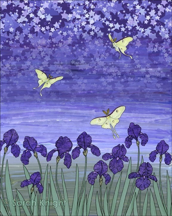
"violet night"
"violet night" was created mostly out of the parts of other illustrations. It's just one of those compositions I assembled for the fun of it.
The irises are something I created for "purple martins & purple irises" which is an image I originally made for one of my calendars (it was for June, since that's when my irises bloom). Anyhow, the irises were originally a pen & ink drawing, which I 'filled' in photoshop — the petals were created from parts of a scan of a salt on watercolor painting and the leaves were created from a scan of an acrylic painting.
The luna moths came from a graphite pencil drawing that I had done as a teenager for the county fair. I scanned them into the computer, colorized them, printed that file, and then colored over it with prismacolors, and scanned that back into the computer. The luna moths are kind of the only part I formatted specifically for this illustration, even though they originated with another composition.
The starry sky came from the background I made for "deer in the winter woods." This illustration was the January picture for one of my calendars. I'm pretty sure the star is a vector graphic, which I spent many hours rotating and layering in a file. For violet night - I used the graphic as a layer over the scan of the painting, and then literally faded out half the graphic with the eraser tool.
Obviously, I color adjusted the scan of the painting that I inevitably used as a background, because, well, I wanted it to be a cooler and bluer shade of violet.
I admit, there are some illustrations that I like just a little bit more, and "violet night" is one of them. Probably mostly because that's my favorite shade of violet — that sort of milky bluish violet color.
25 comments:
Amazing how it all comes together. Beautiful piece.
Those are just gorgeous! My boyfriend works in digital collages as well; it's fascinating to see how all the bits and pieces come together to form a beautiful whole ....
That is beautiful!!!
Hugs
SueAnn
Violet night is truly wondrous. You've built a charmingly pleasing fairy-tale of a colored drawing on top of an already soothing yet energetic abstract. Thank you for outlining what you go through in Photoshop. Sometimes people don't realize how many hours of fine tuning it can take to get something to look exactly how you want it, plus how you incorporate your creative insight. Once again, love this fine piece of artwork!
Absolutely stunning work. I for one, would be lost without Photoshop. For me, it is part of the entire artistic process, as you have so beautifully illustrated here.
Have a wonderful weekend!
lisa.
This is so darn cool...I love it! ...and your process too. I need to learn how to use Photoshop--one of these days...
It is wonderful to read your process, the outcome is quite lovely and magical.
Artistic, it is beautiful of course.
Love that painting and the transition from one colour to purple. I like your blog and your cookies...I'll be following you!
So creative you are, Sarah. What an imagination.
Purple is one of my favorite colors and this piece you created is full of so many different hues.
Simply beautiful. :)
bluish violet- one of my most favorite colors! Great work
Gorgeous illustration - just beautiful!
Wow that is so pretty!
Very, very nice! I love the color too!
Sarah I love your blog. It's so fun and I love your hibernating bear. Thank you for stopping by my blog today. Enjoy your weekend.
Wow.. that's amazing. You sure know what you're doing.. and you do it so well.
So so interesting!! I am so totally clueless about photography but I sure do love seeing experts at work!And your paintings... fabulous!
Ann
WOW - A LOT of work goes into your masterpieces! They are LOVELY!
that's amazing! i'm just in awe of all the digital work that's possible. when i was in art school, i did a lot more hands on - ceramics, printing, photography. nothing digital at all!
What a fun project - to combine your own original work in creation of another original work. What computer program do you use and mac or pc?
nellie
So creative. Love how you picture makes me almost feel like spring is around the corner. Oh how I wish!
Debbie @ Beyond the Dog Dish
Those are such cheerful colors and a happy scene.
I use photoshop on an imac, to answer the question.
I love the background painting in it's own right. It's absolutely stunning.
Really interesting to read about your process though and the way you combine the mediums.
I love photoshop too :) It allows you to wonder and explore before settled on the final piece that you really love XD
The Violet Night is looking really beautiful! Love the sparkling stars and the purple irises!
Post a Comment